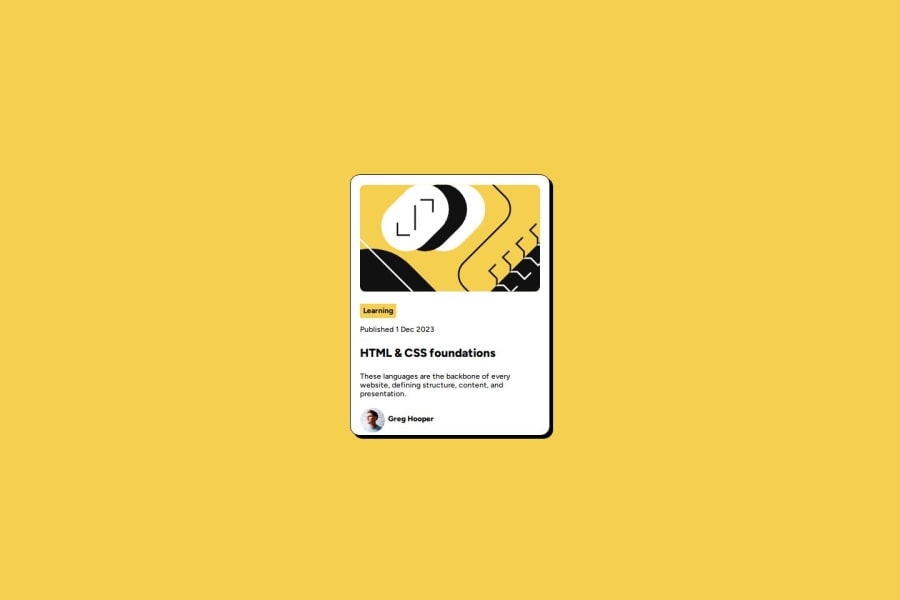
Design comparison
Community feedback
- @henrychrisPosted 5 months ago
The text color for this section: "These languages are the backbone of every website, defining structure, content, and presentation." is off compared to the design. If you check the Figma, you will see the color applied to that section. I suggest using a CSS class so you can reuse the styling.
The font appears small compared to the design too, causing the solution to appear smaller compared to the design. You may want to use a CSS reset or simply add:
html {
    font-size: 100%
}
to the top of your CSS file. This way, your page inherits the font size from the users browser. In other places, you can set font-size using
reminstead ofpxso font size dynamically changes based on the user's font.0
Please log in to post a comment
Log in with GitHubJoin our Discord community
Join thousands of Frontend Mentor community members taking the challenges, sharing resources, helping each other, and chatting about all things front-end!
Join our Discord
