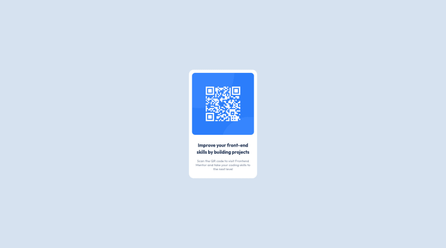
Design comparison
Solution retrospective
Hey, everyone, I've been learning HTML and CSS for a week now, but have decided to make some practice to understand the whole thing better. Can't even say what was the hardest part to make to qr-code itself or to figure out the GitHub. Was really close to burst into tears at some point.
Anw. I was pretty much confused with the mobile version, I remember being taught of media queries, however I'm not sure I used it right. Also the panel size, is it okay for it to be exactly pixeled? Or should I advantage percentages? Just saw a p in CSS I do not need at all.
So, in conclusion any feedback at all would be appreciated. :)
Community feedback
- @KaydenGiang2512Posted over 2 years ago
Design-wise, this is a solid project for a beginner with everything looking nice and centered. However, the link to your GitHub repository isn't working Alexandra, please double-check in case it might be incorrect!
For the code, I noticed 2 huge selector chunks you made on the css (the ones with lots of tags): html, body, div, span, applet, object, iframe, h1, h2, h3, h4, h5, h6, p, blockquote, pre, a, abbr, acronym, address, big, cite, code, del, dfn, em, img, ins, kbd, q, s, samp, small, strike, strong, sub, sup, tt, var, b, u, i, center, dl, dt, dd, ol, ul, li, fieldset, form, label, legend, table, caption, tbody, tfoot, thead, tr, th, td, article, aside, canvas, details, embed, figure, figcaption, footer, header, hgroup, menu, nav, output, ruby, section, summary, time, mark, audio, video { margin: 0; padding: 0; border: 0; font-size: 100%; font: inherit; vertical-align: baseline; }
/* HTML5 display-role reset for older browsers */ article, aside, details, figcaption, figure, footer, header, hgroup, menu, nav, section { display: block; }
which were quite confusing to me as to what you're trying to achieve because CSS can specifically target elements in your html by selecting them individually, instead of gathering them all at once. This is important for readability as well as maintaining your code going forward.
1@kennysykePosted over 2 years ago@KaydenGiang2512 thank you for your feedback. I was told by the teacher that we need to include CSS reset part at the beginning of our CSS file.
0@RyukioMiyamotoPosted over 2 years ago@kennysyke an alternative to this would be to use the selector *, which stands for all elements W3Schools for reference. I use it myself, by setting a basic reset as
*::before, *, *::after { margin: 0; padding: 0; box-sizing: border-box; }
As for the result, looks really good overall, congratulations on your first challenge!
1 - @SamadeenPosted over 2 years ago
Hey!! Cheers 🥂 on completing this challenge.. .
Here are my suggestions..
- You should use <main class="panel"> instead of <div class="panel">.
This should fix most of your accessibility issues
. Regardless you did amazing... hope you find this useful... Happy coding!!!
0
Please log in to post a comment
Log in with GitHubJoin our Discord community
Join thousands of Frontend Mentor community members taking the challenges, sharing resources, helping each other, and chatting about all things front-end!
Join our Discord