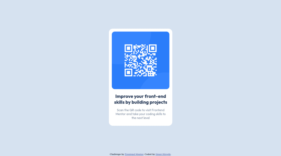
Design comparison
SolutionDesign
Solution retrospective
The most difficult thing for a 100% noob at CSS, was centering the element vertically. So alternative ways are appreciated. I found a lot of ways to do it though, but nothing was as easy and pretty as this.
Everything else I'm pretty much OK with, but do tell if something's funny.
EDIT: I noticed that the fonts were not working for outside connection!
Community feedback
Please log in to post a comment
Log in with GitHubJoin our Discord community
Join thousands of Frontend Mentor community members taking the challenges, sharing resources, helping each other, and chatting about all things front-end!
Join our Discord
