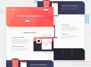
Non-responsive-HTML5-CSS3-AND-JS
Design comparison
Community feedback
- @BaymaGafurovPosted almost 3 years ago
you could use @media query for different displays
0@MuhammadKaleemRazaPosted almost 3 years ago@BaymaGafurov I know, but its annoying to use media query for all the items one by one.
0@BaymaGafurovPosted almost 3 years ago@MuhammadKaleemRaza I would suggest to use sass mixins then, they are very useful and easy to use
0 - @MuhammadKaleemRazaPosted almost 3 years ago
can someone help me? I am having trouble making sites responsive. I make the site on desktop display very easily but when it comes to mobile I am having a hard time. Can someone give me tips on what should I do to make responsive websites easily?
0@tkressmaPosted almost 3 years ago@MuhammadKaleemRaza The biggest tip I have for you is to sign up for Kevin Powell's free "Conquering Responsive Layouts" course. I personally loved it!
0@MuhammadKaleemRazaPosted almost 3 years ago@tkressma Thank You! I will do that.
1
Please log in to post a comment
Log in with GitHubJoin our Discord community
Join thousands of Frontend Mentor community members taking the challenges, sharing resources, helping each other, and chatting about all things front-end!
Join our Discord
