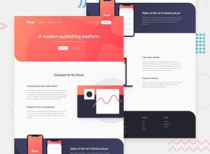
Design comparison
SolutionDesign
Solution retrospective
Haven't worked on mobile view yet. I'm finding it hard to style the svg images per the design but I wasn't able to. Some feedback would be appreciated.
Community feedback
- @CorinaMurgPosted over 1 year ago
Hi Owen,
have you tried a negative margin for the images that have a left or right side that is cut off? For example, for the illustration-editor image, try a negative margin-right. Start with let's say -5rem and see the result, and change it until you get the look you want. Hope this helps a bit. Corina
0
Please log in to post a comment
Log in with GitHubJoin our Discord community
Join thousands of Frontend Mentor community members taking the challenges, sharing resources, helping each other, and chatting about all things front-end!
Join our Discord
