Design comparison
SolutionDesign
Solution retrospective
What are you most proud of, and what would you do differently next time?
I can now barely use flexbox and I will gonna learn more css because I still don't fully familiar with it
What challenges did you encounter, and how did you overcome them?I still can't set the width and height of elements with vh properly so I go back to make it static.
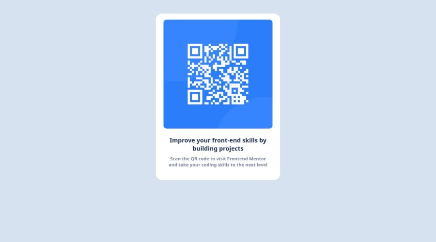
What specific areas of your project would you like help with?I can't make the border radius of the box and its image to nicely balance to each other.
Community feedback
Please log in to post a comment
Log in with GitHubJoin our Discord community
Join thousands of Frontend Mentor community members taking the challenges, sharing resources, helping each other, and chatting about all things front-end!
Join our Discord
