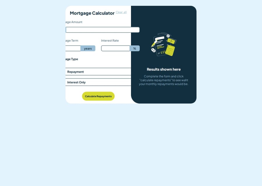


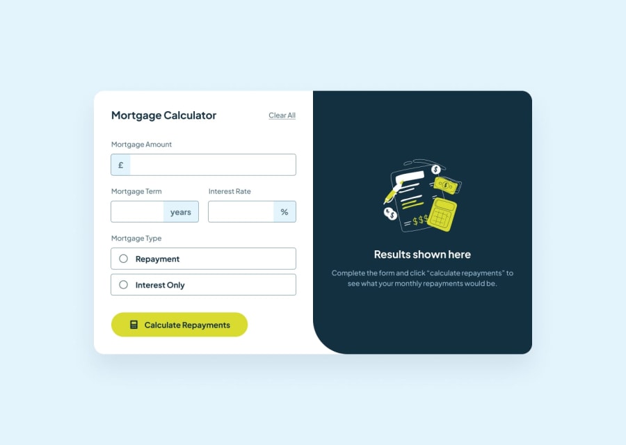
Design comparison
Community feedback
- @khaduj03Posted 3 months ago
Cart Width Issue 🛠️: The cart’s width is currently set to 50%, which is causing the content to overflow. Increasing the width to 80% will provide better design and layout.
Calculate Button Behavior: When clicking the "Calculate" button multiple times, the page behaves like a toggle, which is not the desired functionality. Clicking twice should not reset the page unnecessarily.
Clear Functionality: When clearing the page, both the result and the illustration should reset. However, this is not happening in the current implementation.
Using add and remove Instead of toggle: The toggle method is not suitable here. It’s better used when you want to add a class if it doesn’t exist or remove it if it does. For handling the calculation and clear actions, use add and remove to explicitly manage class changes for better control.
Clear Function for Resetting: Implement a clear function to reset the result and display the illustration when the page is cleared. This will improve the user experience.
You’ve made a great effort so far. Keep learning and improving! Best of luck in your future projects.😊🌟
Marked as helpful1

Please log in to post a comment
Log in with GitHubJoin our Discord community
Join thousands of Frontend Mentor community members taking the challenges, sharing resources, helping each other, and chatting about all things front-end!
Join our Discord