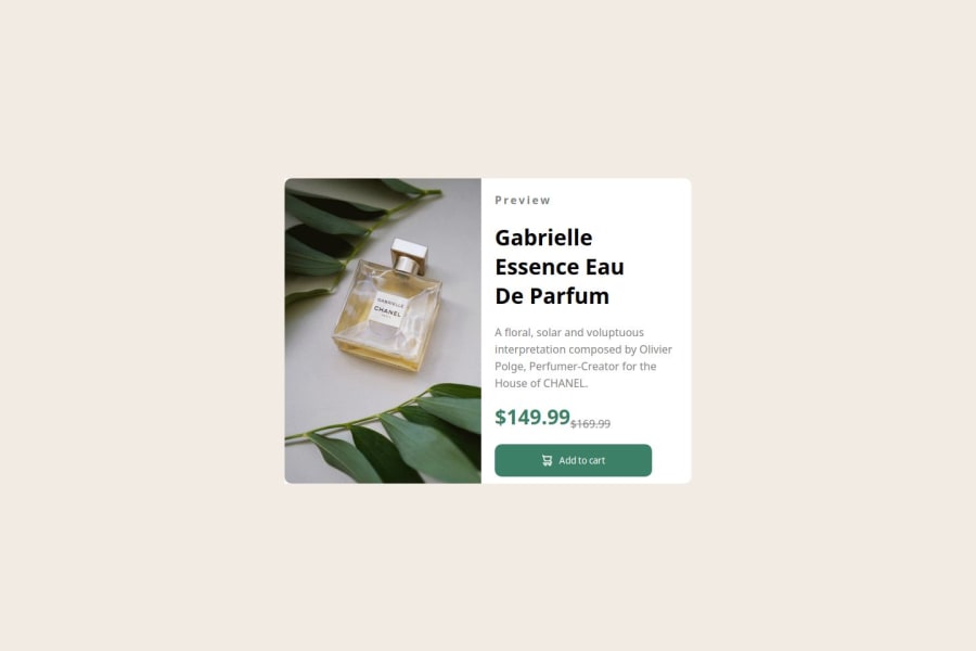
Design comparison
Solution retrospective
I'm proud it didn't take me all day or multiple hours. I can design everything more efficiently and cleaner but that's part of improving.
What challenges did you encounter, and how did you overcome them?I have zero idea how to make the content reshape and maintain the same size on different screen/window sizes. I've yet to overcome them.
What specific areas of your project would you like help with?I need help learning how to make content keep its form and shape in the main window/screen size so that it has the same look on different sizes. Also, I don't know how to properly host a live server. Had to search up a tutorial and borrow the live site link in order to even publish this.
Community feedback
- @YunggBladezPosted 8 months ago
It looks like perhaps the wrong file was uploaded for this one, as the design and solution are completely different. Your file looks pretty good to me. I unfortunately cant make a comparison due to the wrong file upload.
After taking a look at your HTML and CSS on github, I would recommend starting each project, even if its just for practice, with a global reset. Meaning "* { margin: 0; padding 0; box-sizing: border-box; }. I think you did a good job using <br> in your HTML, instead of having to style it in the CSS.
0
Please log in to post a comment
Log in with GitHubJoin our Discord community
Join thousands of Frontend Mentor community members taking the challenges, sharing resources, helping each other, and chatting about all things front-end!
Join our Discord
