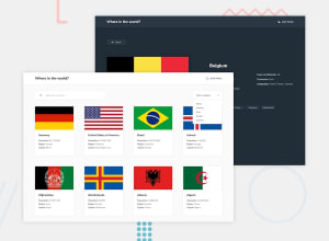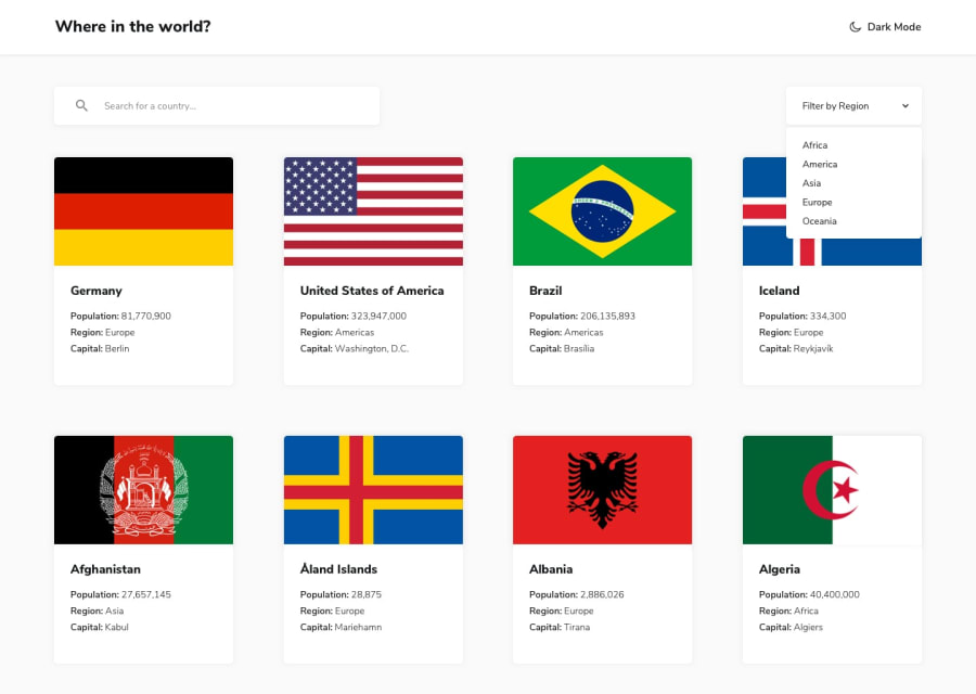
Design comparison
SolutionDesign
Solution retrospective
Decided to use Node to sanitize the incoming data. Kept the client side JS very minimal.
Local Storage utilized to save theme.
Any suggestions or comments welcome.
Community feedback
- @ApplePieGiraffePosted almost 4 years ago
Hey, good work on this challenge, David Payne! 👏
I like the little rotating globe that you added next to the heading! 🙌
The region filter seems to be working fine for me. 👍
I suggest
- Adding a hover state to the options in the region select box to the right of the page.
- Perhaps making sure that the country cards don't cover up the region select box when the select box is open and any one of the country cards are hovered over.
Keep coding (and happy coding, too)! 😁
1 - @jcarlos0511Posted almost 4 years ago
Nice job !. You can improve it, showing only the countries filtered by region.
0@dpayne713Posted almost 4 years ago@jcarlos0511 hmm. 🤔 It is filtering for me.
Is it not for you? If so what browser?
0
Please log in to post a comment
Log in with GitHubJoin our Discord community
Join thousands of Frontend Mentor community members taking the challenges, sharing resources, helping each other, and chatting about all things front-end!
Join our Discord
