Design comparison
Community feedback
- @Abdelrahman0KhaledPosted over 2 years ago
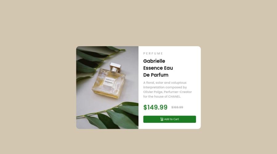
my friend .. all you need ( font size , font family , font weight , background color , colors , act ) in style-guide file with index.html and images file and design file .. you don't need to be pro to git or use it .. its for free with those files .. and about centering .. margin: auto is not bad in horizontal centering .. put it's pad with linear center ( take a look in your solution and design ) pot your card in div and center it in body to and it's work like magic .. or you can center it with transform : translate(-50% , -50%); top: 50%; left:50% ; in your div of card it's work to . (my English not perfect but i wanted to help)
Marked as helpful0 - @Abdelrahman0KhaledPosted over 2 years ago
Hi Adam, Congratulations on completing 🎉 your challenge. It was a great attempt but there are some problems . look this is my first to comment but you can center the card by flex box give body display: flex and justify-content: center and align-items: center after give body min-hight:100vh and you have some problems in fonts and font sizes and font weight good job bro
0@Adam31-jpgPosted over 2 years ago@Abdelrahman0Khaled Hello, thanks !
Yeah I know this, I didn't have the font and the size bcs I'm not pro an for center the card I use margin: auto is better for the natural responsive, I do this bcs my card wasn't on div, I do this directly on body so I can't use flexbox and jcc and aling items but thanks for your comment. Enjoy !
0
Please log in to post a comment
Log in with GitHubJoin our Discord community
Join thousands of Frontend Mentor community members taking the challenges, sharing resources, helping each other, and chatting about all things front-end!
Join our Discord
