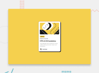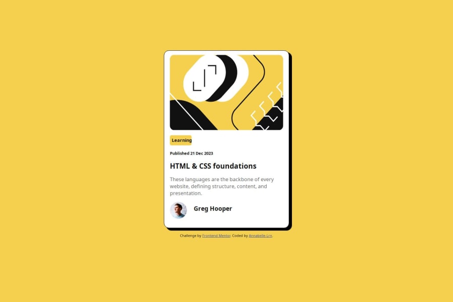
Design comparison
Solution retrospective
i don't use media query and almost all sizes are in rem except for the borders.
Next time I will try to use the clamp() function.
What challenges did you encounter, and how did you overcome them?L'image n'apparait pas au déploiement. Tout est ok en local. Au départ elle était en background de la div, j'ai tenté de l'inclure en HTML avec une balise img mais aucun effet. Si quelqu'un a une idée
What specific areas of your project would you like help with?I'm not sure I used the tags correctly for semantics.
Est ce que j'aurais dû englober les balises dans des div? Est ce qu'il vaut mieux appliquer les classes à une div qui contient la balise ou on peut directement mettre la classe à la balise?
Community feedback
- @StroudyPosted about 1 month ago
Amazing job with this! You’re making fantastic progress. Here are some small tweaks that might take your solution to the next level…
-
Using a full modern CSS reset is beneficial because it removes default browser styling, creating a consistent starting point for your design across all browsers. It helps avoid unexpected layout issues and makes your styles more predictable, ensuring a uniform appearance on different devices and platforms, check out this site for a Full modern reset
-
This does not matter that much at this stage but something to be mindful of for SEO(Search Engine Optimisation),
<meta>description tag missing that helps search engine determine what the page is about, Something like this<meta name="description" content="description goes here" /> -
I think you can benefit from using a naming convention like BEM (Block, Element, Modifier) is beneficial because it makes your CSS more organized, readable, and easier to maintain. BEM helps you clearly understand the purpose of each class, avoid naming conflicts, and create reusable components, leading to a more scalable codebase. For more details BEM,
You’re doing fantastic! I hope these tips help you as you continue your coding journey. Stay curious and keep experimenting—every challenge is an opportunity to learn. Have fun, and keep coding with confidence! 🌟
Marked as helpful0 -
- @Demaxs26Posted about 1 month ago
Hi, you did a great job!
To answer your question, The image is not displayed because the address is not correct, you need to remove the first slash. The correct address is therefore:
src="assets/images/illustrationarticle.webp"In terms of semantics, you should not use h2 before h1 and not use h4 without using h3 before.
You can totally apply a class to a semantic tag.
I hope I was clear in my explanations. Keep it up!
Have a good day !
Marked as helpful0 - @MikDra1Posted about 1 month ago
If you want to make your card responsive with ease you can use this technique:
.card {
width: 90%;
max-width: 37.5rem;
}
On the smaller screens card will be 90% of the parent (here body), but as soon as the card will be 37.5rem (600px) it will lock with this size.
Also to put the card in the center I advise you to use this code snippet:
.container {
display: grid;
place-items: center;
}
Hope you found this comment helpful 💗💗💗
Good job and keep going 😁😊😉
0
Please log in to post a comment
Log in with GitHubJoin our Discord community
Join thousands of Frontend Mentor community members taking the challenges, sharing resources, helping each other, and chatting about all things front-end!
Join our Discord

