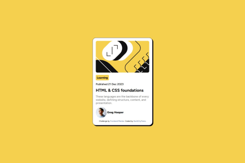
Submitted over 1 year agoA solution to the Blog preview card challenge
No figma so might be a bit off.
@DarkCityTreno

Solution retrospective
What challenges did you encounter, and how did you overcome them?
This one was very similar to the very first one, which in my opinion is a good thing, so no real challenges but defenitely learned a few things.
What specific areas of your project would you like help with?Any criticism is very welcome, since it helps a lot in learning ^_^
Code
Loading...
Please log in to post a comment
Log in with GitHubCommunity feedback
No feedback yet. Be the first to give feedback on DarkCityTreno's solution.
Join our Discord community
Join thousands of Frontend Mentor community members taking the challenges, sharing resources, helping each other, and chatting about all things front-end!
Join our Discord