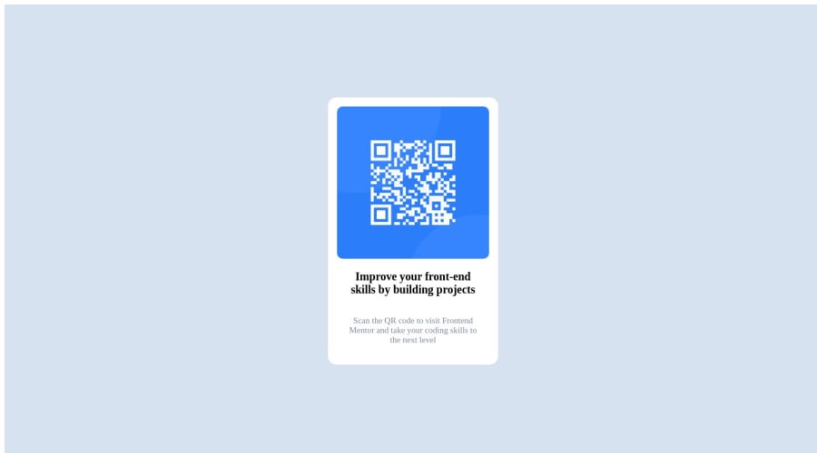
No Clue What I'm Doing; I'm Just an Egg Making a QR Code
Design comparison
Solution retrospective
I don't know what life was like before flexbox, but I don't want it anymore.
I struggled with understanding responsiveness and got really frustrated with how if I manipulate my browser window to shrink horizontally, all my items went haywire. When I tried it on mobile and realized that I don't have to worry about that happening I screeched like a harpy and my poor dog had her day ruined.
Things You Will Probably Find:
- really redundant CSS properties
- 'that one really useful semantic HTML type thing that everyone forgets'
- my burgeoning imposter syndrome.
Community feedback
- @0xabdulkhaliqPosted over 1 year ago
Hello there 👋. Congratulations on successfully completing the challenge! 🎉
- I have other recommendations regarding your code that I believe will be of great interest to you.
HTML 🏷️:
- This solution may cause accessibility errors due to lack of semantic markup, which causes lacking of landmark for a webpage and allows accessibility issues to screen readers, due to accessibility errors our website may not reach its intended audience, face legal consequences, and have poor search engine rankings, highlighting the importance of ensuring accessibility and avoiding errors.
- What is meant by landmark ?, They used to define major sections of your page instead of relying on generic elements like
<div>
or<span>
. They are use to provide a more precise detail of the structure of our webpage to the browser or screen readers
- For example:
- The
<main>
element should include all content directly related to the page's main idea, so there should only be one per page - The
<footer>
typically contains information about the author of the section, copyright data or links to related documents.
- So resolve the issue by replacing the
<div class="container">
element with the proper semantic element<main>
along with<div class="attribution">
into a<footer>
element in yourindex.html
file to improve accessibility and organization of your page
.
I hope you find this helpful 😄 Above all, the solution you submitted is great !
Happy coding!
Marked as helpful0@bonniemiraPosted over 1 year ago@0xAbdulKhalid Thank you so much! Yes, I have a lot to learn still about selecting the correct tags and I do know that 'accessibility considerations should be there from the very beginning'. In that, I did not succeed here. I was focused on the visual structure and formatting my CSS correctly; as far as personal focus it was on learning about Flexbox layouts.
However, a project is the sum of its parts, and I will keep this in mind for my next one. Thanks for your comment and your suggestions - they are vallued. :)
0
Please log in to post a comment
Log in with GitHubJoin our Discord community
Join thousands of Frontend Mentor community members taking the challenges, sharing resources, helping each other, and chatting about all things front-end!
Join our Discord