Design comparison
Solution retrospective
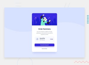
I would like to see feedback on mobile responsive design side. On my Iphone 7 plus looks great unless I rotate my phone...
Community feedback
- @FluffyKasPosted about 3 years ago
Hey,
Good start on the challenge! I'd add a few things though:
-
If you wanted to center your card, you could apply this to your body:
min-height: 100vh
,display: flex
,justify-content: center
,align-items: center
. To make this work, you'll also need to remove that big margin-left on themain
container. I'm also not sure adding a fixed height is necessary :) -
I think your card looks a bit better without that
word-break
. To be honest, I've never even saw that property before so I learned something new :) -
Your button uses the browser's default font-family, unless you set it specifically. Alternatively, you could use
all: unset
to get rid of browser defaults. It's also nice to add a fallback font-family in your code, like serif, sans serif, etc. Google fonts actually gives you the right piece of code when you import the font, I'd suggest using that ^^ -
I'd encourage using relative units instead of pixels for a more responsive/accessible design (when applicable)!
Marked as helpful1@Scarab911Posted about 3 years ago@FluffyKas I'm gratefull of such an amazing insight of yours.
- Centered a card as you suggested, looks not bad. Had to zoom out as my laptop screen not very big :D, I have added fixed height in the end too see how much approximately big margins and padding should i add to elements like title and paragraph. Might be good idea to try remove it now.
- I have tried to remove word-break, increase padding for paragraph but for me it looks awful. So word-breaks still helps to break sentence nice at right words. As shown in card. Glad you find smth new also :)
- Gosh these fonts, I had lots of head ache. Font-family, weights and etc. I have checked the button in a DevTools I see it do not get Red Hat even if I add a font family on a body. So adding it straight helped. Ty.
- As for relative units you mean - em, rem and etc ? I'm still trying them out. But as You could see i was trained mainly pixels :) but if it helps with responsiveness I'm gonna practice them more. As for now it look not bad but still on some width it breaks... :)
1@FluffyKasPosted about 3 years ago@Scarab911 I think your updated solution looks really awesome, well done! :)
I'm not sure you know Kevin Powell's channel, but if you're interested in relative units, responsive design and css in general, he's a great teacher! He has a few videos on units that you may find helpful. :)
As for why it's important to use relative units, apart from responsiveness there's another big reason. Some people (with low vision or people who are a bit older) like to resize the browser's default font-size to make things easier to read. They cannot do that if you use absolute units, while relative units like rem, em, etc will stretch accordingly! I didn't realise this for a long time, then I saw the big zoom my mother uses in her browser... :D
Marked as helpful0@Scarab911Posted about 3 years ago@FluffyKas oh thanks a lot i will check it. And yes after your insights and my update. Solution looks good even on my phone then I rotate it.
0 -
- @Juveria-DalviPosted about 3 years ago
Great work 👍🏻 add div with class attribution in between footer tag
<footer> <div class="attribution"> Challenge by <a href="https://www.frontendmentor.io?ref=challenge" target="_blank">Frontend Mentor</a>. Coded by <a href="https://github.com/Scarab911">Paulius Bieliauskas</a>. </div> </footer> </body>
Marked as helpful1@Scarab911Posted about 3 years ago@JuveriaD hi Thank You I saw that issue showing in a report, gonna update ASAP
1
Please log in to post a comment
Log in with GitHubJoin our Discord community
Join thousands of Frontend Mentor community members taking the challenges, sharing resources, helping each other, and chatting about all things front-end!
Join our Discord