Design comparison
SolutionDesign
Community feedback
- P@monika-webdeveloperPosted 13 days ago
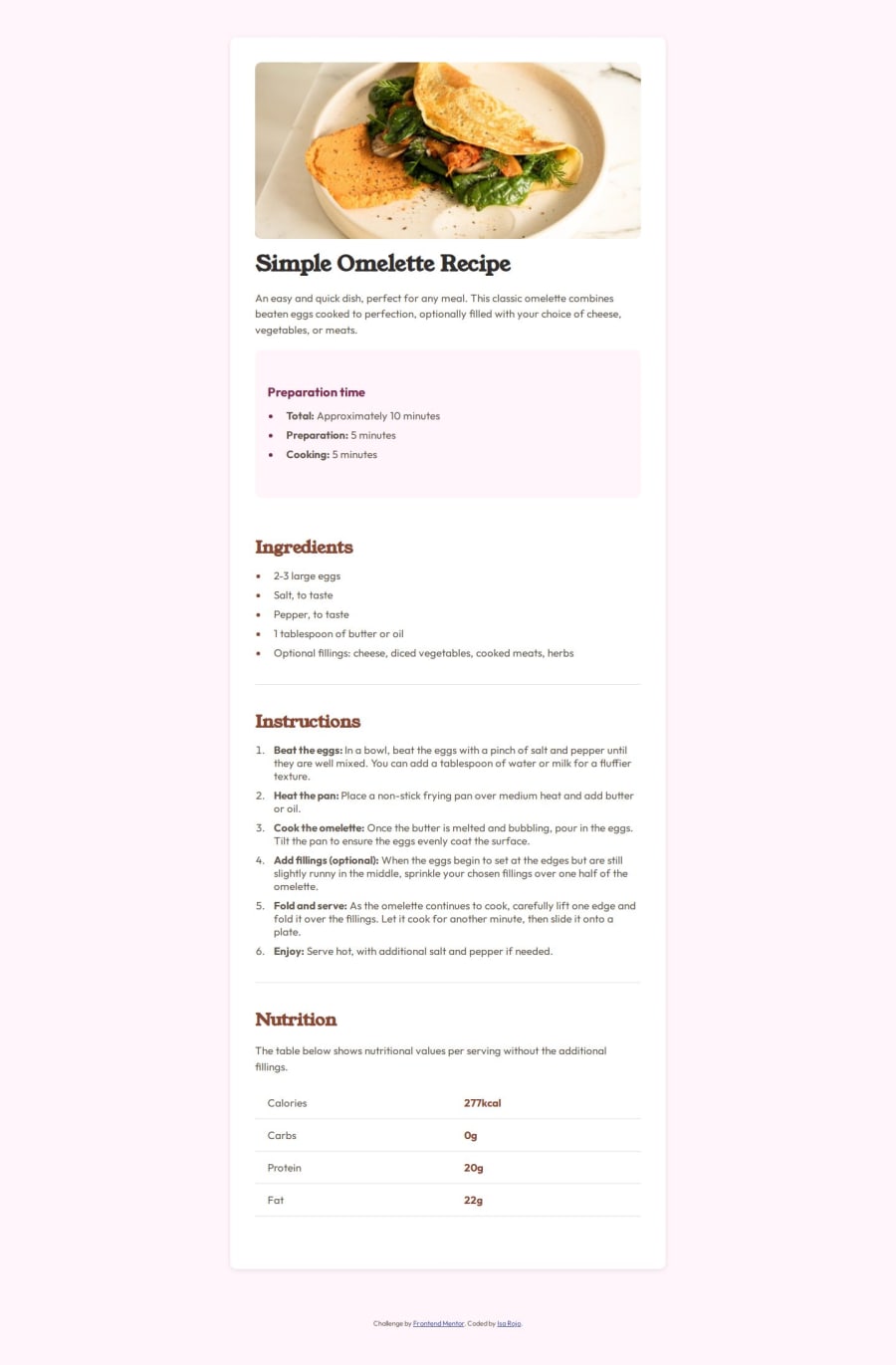
Good job! But there are some things that need improvements. Firsty, the background color is different (yours is too pink). The height of your card is too big and the paddings are different, too. That's why your solution differ from the design.Also on smaller devices the paddings are different. And probably the font is too small ( it's hard to read)
Marked as helpful1
Please log in to post a comment
Log in with GitHubJoin our Discord community
Join thousands of Frontend Mentor community members taking the challenges, sharing resources, helping each other, and chatting about all things front-end!
Join our Discord
