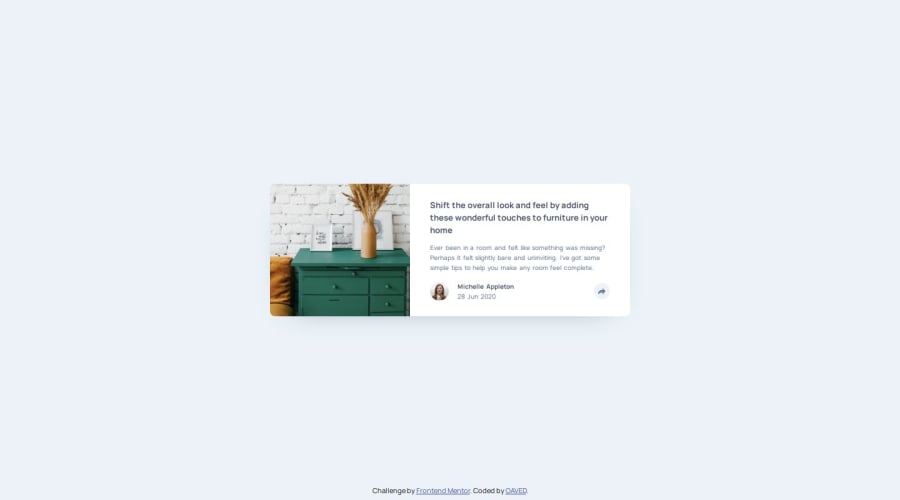
Design comparison
Solution retrospective
I think I did good on the design. Towards the end I did write some cheap solutions to get it looking like I wanted so that wasnt the best move by me. Should stick to clean code to the very end.
What challenges did you encounter, and how did you overcome them?The sizing of the svg-tag was a challenge but I changed some stuff around them to get the ratios right. The sharebar was somewhat of a hustle too but I worked my way through with it slow and steady.
What specific areas of your project would you like help with?I feel like my media-queries are a bit funky. Also, if anyone has a tip to get scaling and sizes right without the Figma file I would be greatful.
Please log in to post a comment
Log in with GitHubCommunity feedback
- @Ayyubiy90
Good job! Keep it up.
Join our Discord community
Join thousands of Frontend Mentor community members taking the challenges, sharing resources, helping each other, and chatting about all things front-end!
Join our Discord
