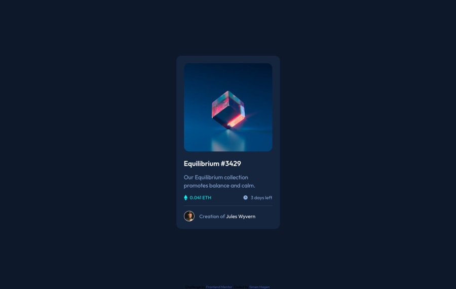
Design comparison
Solution retrospective
so my third challenge, feedback is appreciated - maybe on the readme also, how i can improve filling out important info. layout went decent this time - what i had problem was with the preview icon and background overlay. any easier way i can do this?
and still struggling with naming classes - what is recommended naming convensions?
Community feedback
- @PhoenixDev22Posted over 2 years ago
Hello Simen Hagen,
Congratulation on completing this challenge. Excellent work! I have few suggestions regarding your solution, if you don't mind:
HTML
- The link wrapping the equilibrium image should either have
Sr-only
text, anaria-label
oralt
text that says where that link takes you (not describes the image).
- For any decorative images, each img tag should have empty
alt=""
and addaria-hidden="true"
attributes to make all web assistive technologies such as screen reader ignore those images in( icon-ethereum, icon-clock ).
- If you wish to draw a horizontal line, you should do so using appropriate CSS. You may remove the
<hr>
, you can useborder-top:
to the avatar's part.
- Adding
rel="noopener"
orrel="noreferrer"
totarget="_blank"
links. When you link to a page on another site usingtarget=”_blank”
attribute , you can expose your site to performance and security issues.
Hopefully this feedback helps.
Marked as helpful1@SimenHagen86Posted over 2 years ago@PhoenixDev22 Thanks for the tips and feedback! was your solution that helped me get the preview to show right:) made me scrap the first one that i had images instead of anchors.
ill make sure too read up on this.
1 - The link wrapping the equilibrium image should either have
- @DavidMorgadePosted over 2 years ago
Hello Simen, congrats on finishing the challenge, you did a really good job with the component layout!
-
I would like to recommend you BEM, is one of the greatest naming convention for vanilla CSS and also one of the best approach when using SASS/SCSS, you will not regret using BEM cause you will always identify your classes and get an unique name on each of them!
-
Try adding also screenshots of your project into your readme file, you can take screenshots of the current webpage on firefox just by rightclicking and selecting "take screenshot"
Hope my feedback helps you! good job!
Marked as helpful1@SimenHagen86Posted over 2 years ago@DavidMorgade
Thanks! updated with screenshot.
thanks for feedback and tips - will read up again with BEM
1 -
Please log in to post a comment
Log in with GitHubJoin our Discord community
Join thousands of Frontend Mentor community members taking the challenges, sharing resources, helping each other, and chatting about all things front-end!
Join our Discord