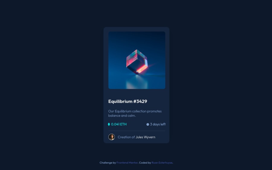
Design comparison
Solution retrospective
Hello everyone! Any feedback on my solution would be much appreciated!
Community feedback
- @PhoenixDev22Posted almost 3 years ago
Hello, I have some suggestions regarding your solution:
-
There should be two landmark components as children of the body element - a
main(which will be the component) and afooter(which will be the attribution). -
Anything with a hover style in a design means it's interactive. you need to add an interactive element around the image
Equilibrium #3429, Jules Wyvern. -
The
alttext of theshouldn't be `creator `, it should beJules Wyvern ``.Tips for writing 'good' alt text -
the
icon-viewdoesn't really need to be in the html, you could do it with css. If you want it to stay in html it needs to be aria-hidden or role presentation with empty alt -
the link should be wrapping the original image and either have
Sr-onlytext, anaria-labeloralttext that says where that link takes you. -
You can use an unordered list
<ul>and in each<li>, there would be<img >and<p>.
<ul class=""> <li> <img class ="card__ETH-image" src="images/icon-ethereum.svg" alt=""aria-hidden="true"> <p class ="card__ETH-text">0.041 ETH</p> </li> <li> <img class = "card__clock-image" src="images/icon-clock.svg" alt="" aria-hidden="true"> <p class = "card__clock-text">3 days left</p> </li> </ul> <div class="">/* **or** you can use semantic tags (<figure> and <figcaption> )*/ <img src="./images/image-avatar.png" alt=" Jules Wyvern" class="card__image-avatar"> <p class ="card__image-text"> Creation of <a href="#">Jules Wyvern</a></p> </div>- For your question, To center the card on the middle of the page , you can use the flexbox properties and
min-height: 100vhlike this :
body{ display:flex; align-items: center; justify-content: center; min-height: 100vh;-
no need for
<br>, (use margins and padding as needed ) -
No need for
<hr>, you can useborder-topto the avatar's div . -
Never use
pxfor font-size. -
You should use
emandremunits .Bothemandremare flexible, Usingpxwon't allow the user to control the font size based on their needs.- an explicit width is not a good way . Remove the width from the card component and change it to
max widthinstead for the card. That will let it shrink a little when it needs to.
- an explicit width is not a good way . Remove the width from the card component and change it to
-
I recommend to remove the
heightof the card , you almost never want to set it , let the content define the height.
Overall your solution is good , Hopefully this feedback helps.
Marked as helpful1 -
- @GitHub-dev12345Posted almost 3 years ago
In this code Changes this element <div class="container"> to Used This Code
<main class ="Container">, you used main tag, than your choice to write the class in main tag or not.but my recommendation you not use class="container".
And in Body tag CSS Code You used this code: margin : 110px auto;
Marked as helpful0 - Account deleted
Hello there! 👋
Congratulations on finishing your challenge! 🎉
I have some feedback on this solution:
- Always Use Semantic HTML instead of
divlike<main><header>, etc for more info.
if my solution has helped you do not forget to mark this as helpful!
Marked as helpful0 - Always Use Semantic HTML instead of
- @RuanEsterhuysePosted almost 3 years ago
Thanks for taking the time to give me such valuable feedback. I appreciate it.
0 - @RuanEsterhuysePosted almost 3 years ago
Thanks for the feedback! I fixed the accessibility issues. What can I do to get the exact positioning right?
0@GitHub-dev12345Posted almost 3 years ago@RuanEsterhuyse in body tag use flexbox property like :- body{ display: flex; justify-content: center; align-items: center; margin: 5px auto; }
0
Please log in to post a comment
Log in with GitHubJoin our Discord community
Join thousands of Frontend Mentor community members taking the challenges, sharing resources, helping each other, and chatting about all things front-end!
Join our Discord
