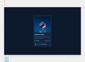
nft-preview-card-component-main
Design comparison
Solution retrospective
Feedback
Community feedback
- @MiculinoPosted almost 3 years ago
Hey @Programing-School
Congrats on completing the challenge.
Here are my suggestions based on your final solution:
-
Structure your HTML elements better. For example, wrap the avatar img and the text next to it inside another
<div></div>element -
Avoid using inline CSS styling
-
Use more meaningful class names
-
It's bad practice to use margin values like that to position your card component. Better to use something such as flexbox display
-
Box shadow for your card is too much - reduce it and also soften it a bit more
-
The ETH icon is missing
-
Image hover effect is missing. Check this out for reference https://www.w3schools.com/howto/howto_css_image_overlay.asp
-
Reduce space around image
-
Reduce rounded corners of the image
-
Add more space around the card's content
-
Missing the appropriate font(s) from the challenge
-
Make hr line color more subtle / change color
-
Try to avoid using fixed values for width / height properties (especially if they're px based)
Hope my tips will be useful to you. Keep up the good work!
Marked as helpful0 -
Please log in to post a comment
Log in with GitHubJoin our Discord community
Join thousands of Frontend Mentor community members taking the challenges, sharing resources, helping each other, and chatting about all things front-end!
Join our Discord
