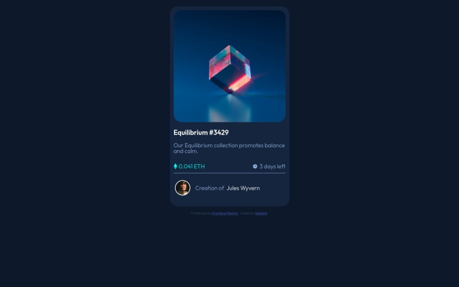
Not Found
Not Found
Not Found
Not Found
Not Found
Not Found
Not Found
Not Found
Not Found
Not Found
Not Found
Not Found
Not Found
Not Found
Not Found
Not Found
Not Found
Not Found
Not Found
Not Found

Submitted

nft-preview-card-component(html&css)

@Nishant-afk

Desktop design screenshot for the NFT preview card component coding challenge

This is a solution for...

  • HTML
  • CSS
1newbie
View challenge

Design comparison


SolutionDesign

Solution retrospective


Please provide suggestion on writing efficient code:

  1. I have used very basic of html/css to do the card.
  2. I had a hard time trying to do the active states of images and the line with images + text(the 3 days left): is there a better way?
  3. I did try to match everything as i can but i can't seem to make it fit in one page(the vertical height- tried using max-height and setting the height but no success) NEED HELP FOR THIS

Community feedback

@gccavalheiro

Posted

Analyzing your code, in the part where you talk about coin and days, you could use the flex box,

Example:

  • HTML
<div class="body-info">
  <div class="coin">
    <img src="./assets/images/icon-ethereum.svg" alt="Icon Ethereum">
    0.041 ETH
  </div>

  <div class="days-left">
    <img src="./assets/images/icon-clock.svg" alt="Icon Clock">
    3 days left
  </div>
</div>
  • CSS

This code will make the child divs next to each other on the same "line", position the children to the far edge of the parent div, and center the children on the Y axis.

.body-info {
    display: flex;
    flex-direction:row;
    align-items: center;
    justify-content: space-between;
}

This code will make the icons and text stay on the same "line" and centered on the Y axis, using "flex: 1" will make the divs take up all the remaining space, as we have 2 "coin" and "days" divs -left", both will have 50% occupation of the parent div

.body-info .days-left {
    display: flex;
    align-items: center;
    flex: 1 or width: 100%;
}

to perform the separation line I advise using an empty div or using the <hr/>

<hr class="divider"/>
.divider {
    margin: 24px 0 16px;
    border-top: 2px solid #FFF;
}

*The code above is a short syntax that means: margin-top: 24px; margin-right: 0; margin-bottom: 16px; margin-left: 0;

To create the avatar, using the same flex box technique makes it simple

<div class="card-avatar">
    <div class="avatar-image">
        <img src="./assets/images/image-avatar.png" alt="Image Avatar" />
    </div>

    <div class="avatar-text">
        Creation of<a href="#">Jules Wyvern</a>
    </div>
</div>
.card-avatar {
    display: flex;
    align-items: center;
    width: 100%;
}

.card-avatar .avatar-image {
    width: 32px;
    min-width: 32px;
    height: 32px;
    min-height: 32px;
    border: 2px solid var(--white);
    border-radius: 50%;
    overflow: hidden;
    margin-right: 16px;
}

.card-avatar .avatar-image img {
    object-fit: cover;
}

.card-avatar .avatar-text {
    color: var(--primary-soft-blue);
    letter-spacing: .6px;
}

*To make a good avatar icon, I advise using a div and inside that div insert the user's image, with that you can use the css property object-fit: cover, making the image fit according to the size of the div father

Marked as helpful

1

@Nishant-afk

Posted

@gccavalheiro Thank you very much for such detailed feedback. Really appreciate the explaination with actual code.

0

@manojks092

Posted

Nishant let me give you my personal opinion on your issues : a) It doesnt matter whether you use basic or advance html/css, what does matter is the semantic of the site. b) for active states you can use pseudo-classes, along with the container that can be set using pseudo-elements(::before) and thus with the help of opacity and z-index you will achieve the hovering over effect over the image. c) as this site is simply from top to bottom you dont need to do anything exceptionally, as the site layout is same for smaller and larger devices, yea somewhere you might need to use flex for aligning items vertically or horizontally. For your height issues, to fit it in a single page, you can wrap the whole document in a container and set the height of the container as height:100vh; and then for different sections you can distribute the height accordingly. The last point might be confusing for now but when you'll use semantic html then things will become more clear to you. Hope this will be helpful. Happy Coding :D

Marked as helpful

1

@Nishant-afk

Posted

@manojks092 Thank you for feedback and answering my queries

0

@sachinkhatrilin

Posted

You may use flex container for the two lines with images+text, so that those two lines be treated as two columns. Don't use max-height. You may limit the image to about 300px width. Edit: Use class:hover

0

Please log in to post a comment

Log in with GitHub
Discord logo

Join our Discord community

Join thousands of Frontend Mentor community members taking the challenges, sharing resources, helping each other, and chatting about all things front-end!

Join our Discord