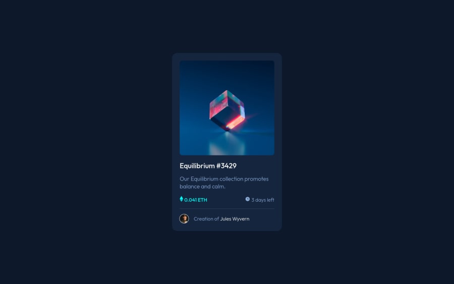
Design comparison
Solution retrospective
Is there a simpler way to do the image rollover than I have done in this solution? I couldn't figure out how to get the eye image to be the correct size.
Community feedback
- @Enguerrand-devPosted over 2 years ago
Hey T-BAX,
Nice work ! Well done !
Regarding the animation of the image, for the eye, I will divide it in two. A div for the overlay to the hover and in this div, I would put the icon at the right size in px for example.
<div class="hero_img_container">
      <img src="images/image-equilibrium.jpg" id="hero_img" alt="">
      <div class="overlay">
          <img src="x" class="icon"/>
       </div>
 </div>
And I will set the overlay as a flex container so the icon can be center perfectly !
I will also add a transition on the overlay block for a smoother rendering.
If u need more explenation feel free to reach me !
Sorry for my bad english ahah
0
Please log in to post a comment
Log in with GitHubJoin our Discord community
Join thousands of Frontend Mentor community members taking the challenges, sharing resources, helping each other, and chatting about all things front-end!
Join our Discord
