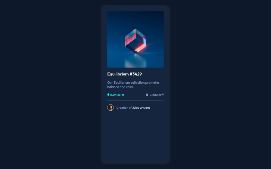
Design comparison
Solution retrospective
I had difficulty with the issue of transitions since it is something that I do not handle very well, but I was able to solve it by watching some blogs and video tutorials. Anyway, I don't know if I managed to apply it correctly. I look forward to any suggestions on it.
Community feedback
- @DavidMorgadePosted about 2 years ago
Buenas Jorge, enorabuena por terminar el challenge, te quedo bastante bueno tu NFT
Con tu permiso, me gustaría dejarte algunos consejos que pueden ayudarte en futuras challenges.
Lo primero de todo, para que no se te quede el contenedor del componente estirado completamente hasta el final, agregale un
align-items: center;
a tu body, para que quede alineado completamente horizontalmente y así no se estirará el contenedor hasta el final, losmargins
delmain
puedes quitarlo ya que así ya quedaría tu componente completamente centrado con flexbox!El tema del
:hover
te quedo bastante bien en mi opinión, tambien podrías envolver todo en undiv
y ponerle el color de background, y poner que cuando hagas:hover
en la imagen le agregues algo de opacidad, mostrado así el color de fondo deldiv
!, pero la solución que usaste también es completamente valida y buena!Espero que mi feedback te sea de ayuda, si tienes cualquier duda o lo que sea, no dudes en preguntarme!
Marked as helpful1 - @PhoenixDev22Posted about 2 years ago
Hello Jorge Muñoz,
Congratulation on finishing this challenge. Excellent work! I have few suggestions regarding your solution, if you don't mind:
HTML
- The most important part in this challenge interactive elements. Since there's a :hover state on the image and means it's interactive, So there should be an interactive element around it. When you create a component that could be interacted with a user , always remember to include interactive elements like(button, textarea,input, ..)
for this imagine what would happen when you click on the image, there are two possible ways:
1: If clicking the image would show a popup where the user can see the full NFT, here you use<button>
. 2:If clicking the image would navigate the user to another page to see the NFT, here you can use<a>
.
For the same reason, you can use
<a>
to wrapEquilibrium #3429 and Jules Wyvern
.- The link wrapping the equilibrium image should either have
Sr-only
text, anaria-label
oralt
text that says where that link takes you.
- For middle part of the card
class="div__eth"
, you can use an unordered list<ul>
, in each<li>
there should be<img>
and<p>
. That way you can align them centrally.
- For any decorative images, each img tag should have empty
alt=""
and addaria-hidden="true"
attributes to make all web assistive technologies such as screen reader ignore those images in(icon-view, icon-ethereum, icon-clock ).
- Profile images like that avatar are valuable content. The alternate text of the avatar’s image should not beempty. You can use the creator's name
Jules Wyvern
. Read more how to write an alt text
- There are so many ways to do the hover effect on the image, The one I would use is pseudo elements
::before, ::after
. You can use pseudo-elements to change the teal background color to hsla. Then the opacity can be changed from 0 to 1 on the pseudo element on the hover. Also using pseudo elements makes your HTML more cleaner as there's no need for extra clutter in the HTML.
Aside these, great job on this one. hopefully this feedback.
Marked as helpful0 - The most important part in this challenge interactive elements. Since there's a :hover state on the image and means it's interactive, So there should be an interactive element around it. When you create a component that could be interacted with a user , always remember to include interactive elements like(button, textarea,input, ..)
for this imagine what would happen when you click on the image, there are two possible ways:
- @lifeaddiktPosted about 2 years ago
Hi :),
Congratulations for your solution !
If you want to have your card in the center of your page change the "max-height" by min-height and add align-items : center on your body element !
Marked as helpful0
Please log in to post a comment
Log in with GitHubJoin our Discord community
Join thousands of Frontend Mentor community members taking the challenges, sharing resources, helping each other, and chatting about all things front-end!
Join our Discord