


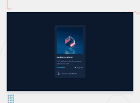


I've had a look on a smaller screen and inspected the code and notice some other important foundational issues with the way you're styling this. It looks very broken on my phone.
Here are some changes I made in browser that should help:
.card {
  /* grid-template-columns: 300px; */
  grid-template-columns: minmax(auto, 300px); // let it grow up to a point but be small if it needs to be
}

.container {
  /* max-width: 144rem; */.    // no reason to do this
  /* height: 100vh; */
  /* align-items: center; */
  /* justify-content: center; */
  min-height: 100vh;   // never limit height or items will overlap
  place-content: center; // more succinct
  padding: 1.5rem;  // in this case you don't want the card to touch screen edges
}

html {
 font-size: 62.5%
 // Gah ! Don't do this. No reason to and it creates an accessibility nightmare if you arent really careful;
}
Marked as helpful
@DreamCoder7
Posted
@grace-snow Thanks, it's help full but i set the font-size on html cause when user change the default value (which is 16px) on browser, it also change the page style that is way.
@redstorm-hub it’s really really bad for accessibility, please don’t do that unless you know what else you need to do to correct it for people who need the default font size.
The correct way to do it is keep rems as they are, keep html or :root font size at 100% (or larger is ok for large screens)
Then change the base font size using rem on the body. This can have the same result for most users but doesn’t put the site at an accessibility risk for those with vision impairments who can use a variety of different zoom or text settings to make your site work for them
