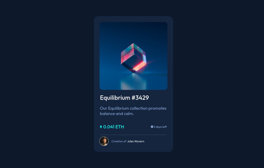
Design comparison
Solution retrospective
I'd appreciate it if you can take a look at my solution and give me some feedback. Constructive criticism is what I'm looking for! don't hesitate to be brutally honest :)
Community feedback
- @RioCantrePosted about 3 years ago
Hello there! Good job in this project. You did well in implementing the design and I would like to suggest the following for you...
- Add the hover state for the text, for example...
.card-header:hover { color: hsl(178, 100%, 50%); cursor: pointer; } .creator:hover { color: hsl(178, 100%, 50%); cursor: pointer; }- Same with the hero image... you should add the hover state with the eye icon
Hope this helps and Keep going!
1 - @NaveenGumastePosted about 3 years ago
Hay ! Good Job you made it look nearly perfect to the preview
Keep up the good work!👍
1@AmmarCodePosted about 3 years ago@Crazimonk Thank you! I appreciate your support!!
0 - @khanisrarPosted about 3 years ago
Awesome
1 - @Aadv1kPosted about 3 years ago
Hey Ammar, congrats on completing your second challenge on frontendmentor! Here are some fixes you should make to better your site.
- To create the little hover overflow on the image (as seen in the active-states) you can use position absolute to position an element over the image, with opacity set to 0, then on hover you can maybe change the opacity to 0.5, this is how I implemented the hover effect, you can do it by other means if you feel like it.
- Add a mobile media query to reduce the width of the container and make the fonts a bit smaller. Ciao ~ Aadvik
1@AmmarCodePosted about 3 years ago@Aadv1k Thank you for the great tips, I'll implement that soon.
0
Please log in to post a comment
Log in with GitHubJoin our Discord community
Join thousands of Frontend Mentor community members taking the challenges, sharing resources, helping each other, and chatting about all things front-end!
Join our Discord
