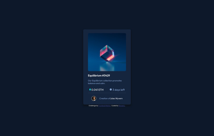
Design comparison
Solution retrospective
Please do not forget to leave me your feedback by taking a look at the code as it is always good to be improving.
Thank you very much β€
Community feedback
- @NaveenGumastePosted almost 3 years ago
Hello Renzen Lama ! Congo π on completing this challenge
Just one thing:
- add
border-radius
to the card
happy Codingπ
Marked as helpful1 - add
- @PhoenixDev22Posted almost 3 years ago
Hello @RenzenL,
Congratulation on completing another frontend mentor challenge.
I have some suggestions regarding your solution:
-
There should be two landmark components as children of the body element - a
main
(which will be the NFT card ) and afooter
(which will be the attribution).<Footer>
should not be in the<main >
. HTML5 landmark elements are used to improve navigation . -
Anything with a hover style in design means it's interactive. you need to add an interactive element
<a>
around the image ,Equilibrium #3429 and Jules Wyvern
and add a hover effect on them. -
For any decorative images, each img tag should have empty
alt=""
andaria-hidden="true"
attributes to make all web assistive technologies such as screen reader ignore those images in(icon-view, icon-ethereum, icon-clock
). -
The avatar's alt should not be
"avatar img"
it's meaningless , you can useJules Wyvern
. Read more how to write an alt text -
the link should be wrapping the main image and either have
Sr-only
text, anaria-label
oralt
text that says where that link takes you. -
You can use <ul> to wrap
class="space-between"
and in each<li>
there would be<img>
and<p>
.
General point : Really important to keep css specificity as low/flat as possible. The best way to do styling is single class selectors. Remember a css reset on every project. That will do things like set the images to display block and make all browsers display elements the same.
Overall , your solution is good. Hopefully this feedback helps.
Marked as helpful1@RenzenLPosted almost 3 years ago@PhoenixDev22 Thank you for this comprehensive feedbackπ, I will try and implement your advice ASAP .
1 -
- @GitHub-dev12345Posted almost 3 years ago
Nice Coding πππ Congratulation to complete the challenge β€οΈπ My small suggestion : 1.In Card design CSS Code Used this:
transform : scale(0.8); this property decrease the size of card. π
large size for increase the number of scale & small size for decrease the number of scale
I hope you find this helpful
Marked as helpful1 - @denieldenPosted almost 3 years ago
Hi Renzen, I took some time to look at your solution and you did a great job!
Also I have some tips for improving your code:
- remove all
margin
fromcard
class because with grid they are superfluous - You can add the effect
:hover
creating adiv
that appears on hover. I used tailwind but you can still see and understand which css properties you can use to do the same. Look here -> my solution - after try to add a little
transition
on the element with hover effect
Overall you did well :)
Hope this help and happy coding!
Marked as helpful1 - remove all
Please log in to post a comment
Log in with GitHubJoin our Discord community
Join thousands of Frontend Mentor community members taking the challenges, sharing resources, helping each other, and chatting about all things front-end!
Join our Discord