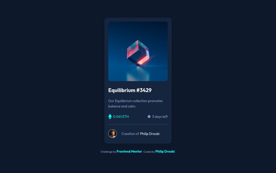
Design comparison
Solution retrospective
Hey everyone 🙋♂️, this is my solution for nft-preview-card-component challenge,
I've added some special effects when hovering, please take a look and give me some feedback. Thanks :)
Community feedback
- @PhoenixDev22Posted over 2 years ago
Hello Philip-dro,
Congratulation on completing this challenge. Excellent work! I have few suggestions regarding your solution, if you don't mind:
HTML
- The most important part in this challengeinteractive elements. Since there's a :hover state on the image and means it's interactive, So there should be an interactive element around it. When you create a component that could be interacted with a user , always remember to include interactive elements like(button, textarea,input, ..)
for this imagine what would happen when you click on the image, there are two possible ways:
1: If clicking the image would show a popup where the user can see the full NFT, here you use<button>. 2:If clicking the image would navigate the user to another page to see the NFT, here you can use<a>.
For the same reason, use
<a>to wrapEquilibrium #3429 and Jules Wyvern.- The link wrapping the equilibrium image should either have
Sr-onlytext, anaria-labeloralttext that says where that link takes you.
- For any decorative images, each img tag should have empty
alt=""and addaria-hidden="true"attributes to make all web assistive technologies such as screen reader ignore those images in( icon-ethereum, icon-clock ).
- Profile images like that avatar are valuable content. The alternate text of the avatar’s image should not be
image-avatar.png, it’s meaningless. Also, it should not be hyphenated. You can use the creator's nameJules Wyvern. Read more how to write an alt text
- If you wish to draw a horizontal line, you should do so using appropriate CSS. You may remove the
<hr>, you can useborder-top:to the avatar's part.
- For middle part of the card
class="info", you can use an unordered list<ul>, in each<li>there should be<img>and<p>. That way you can align them centrally.
- Adding
rel="noopener"orrel="noreferrer"totarget="_blank"links. When you link to a page on another site using target=”_blank” attribute , you can expose your site to performance and security issues.
- There are so many ways to do the hover effect on the image, The one I would use is pseudo elements
::before, ::after. You can use pseudo-elements to change the teal background color to hsla. Then the opacity can be changed from 0 to 1 on the pseudo element on the hover. Also using pseudo elements makes your HTML more cleaner as there's no need for extra clutter in the HTML. The icon view doesn’t really need to be in the HTML. You can use CSS for it.
Question: why did you use a
<section>?According to MDN ,
<section>is a generic sectioning element that is used whenever it doesn’t make sense to use the other more semantic ones.** It is a container that stores self-contained content that still makes sense when placed in a different context.**If you are only using the element as a styling wrapper, use a <div>. Visually, your section is probably going to stand out somehow; a different colored background or some other way to distinguish it from the other content on the page. Adding a label to the section allows it to stand out to non-visual users.You can read more in CSS tricks
As you said, the image and the rest of the content are related in the largest component.
Overall, Your solution is good. Hopefully this feedback helps.
Marked as helpful2@Philip-DroubiPosted over 2 years ago@PhoenixDev22 Thanks for your valuable comment 😃
2 - The most important part in this challengeinteractive elements. Since there's a :hover state on the image and means it's interactive, So there should be an interactive element around it. When you create a component that could be interacted with a user , always remember to include interactive elements like(button, textarea,input, ..)
for this imagine what would happen when you click on the image, there are two possible ways:
- @zakharchevnaPosted over 2 years ago
I am impressed by your solution, especially this amazing animation :)
1 - Account deleted
Congrats on completing this challenge!
Card looks great!
To clean up your code, I recommend using the following layout for your code:
   <body>
      <article>
        <img src="" alt="" />
        <div class="text-container">
          <h1></h1>
          <p></p>
        </div>
        <hr />
        <div class="author-container">
          <img src="" alt="" />
          <p></p>
        </div>
      </article>
    </body>
To center your card perfectly in your page, remove all the widths you added to you container class;
width: 1250px,width: 1170px,width: 970px, andwidth: 750px; (they're not needed)Next remove the
margin: autofrom your main element.Once done, your card will be centered regardless of screen size.
1
Please log in to post a comment
Log in with GitHubJoin our Discord community
Join thousands of Frontend Mentor community members taking the challenges, sharing resources, helping each other, and chatting about all things front-end!
Join our Discord
