Design comparison
Community feedback
- @tatasadiPosted 12 months ago
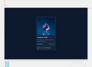
Good job on completing the Frontend Mentor challenge! Your implementation of the NFT card component in React shows a good understanding of layout and styling. The structure of your component is clear, and the use of hover states adds a nice interactive touch to the card.
One area for improvement is in how you're handling colors. Currently, you're using inline styles and direct hex color codes within your Tailwind CSS classes. To make your component more maintainable and your color scheme more consistent, you could define your colors in the Tailwind config file. This approach has several benefits:
Consistency: By defining colors in one place, you ensure consistency across your application. This makes it easier to adhere to a design system.
Reusability: Once a color is defined in the Tailwind config, it can be reused throughout your application, reducing repetition and potential for error.
Maintainability: If the color scheme changes in the future, you only need to update the colors in the Tailwind config, rather than searching through your entire codebase.
Here's how you can define custom colors in your Tailwind config:
// tailwind.config.js
module.exports = {
  theme: {
    extend: {
      colors: {
        'dark-blue': '#15263F',
        'light-blue': '#8BACD9',
        'bright-cyan': '#00FFF8',
        // ... other custom colors
      }
    }
  }
}
Then, you can use these colors in your component like so:
<div className="bg-dark-blue ...">
    ...
    <p className="text-light-blue ...">...</p>
    <span className="text-bright-cyan ...">...</span>
    ...
</div>
This will make your code cleaner and your styling more consistent. Keep up the great work, and I'm looking forward to seeing more of your projects in the future!
Marked as helpful0
Please log in to post a comment
Log in with GitHubJoin our Discord community
Join thousands of Frontend Mentor community members taking the challenges, sharing resources, helping each other, and chatting about all things front-end!
Join our Discord
