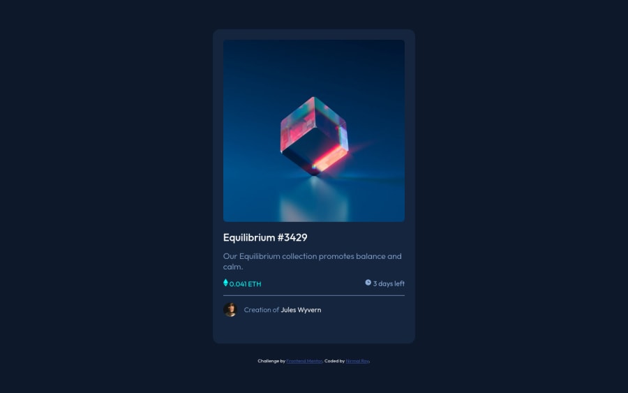
Design comparison
SolutionDesign
Solution retrospective
I always find hard to resize something or link images and svg's, learnt a lot while doing this project.
Community feedback
- @pinhobPosted over 1 year ago
Hey, Nirmal! Very cool solution! Congrats!
I also learned a lot doing this challenge. 🤓
Two suggestions I have, if you want to try to add more elements to your solution:
- If you want to do the white border in the author avatar, like in the original design, you can use this code in the
img
style:
border: 1px solid var(--color-primary); border-radius: 50%;
- If you want to do the hover effect in the NFT image, you can solve it using the pseudo-elements
::before
or::after
in your image container. If you want to have an idea, I found this codepen helpful to have a grasp of how to do it. For the eye icon being centered, I used flexbox inside my::after
selector.
And congrats again for the project. Good coding! 🚀
0 - If you want to do the white border in the author avatar, like in the original design, you can use this code in the
Please log in to post a comment
Log in with GitHubJoin our Discord community
Join thousands of Frontend Mentor community members taking the challenges, sharing resources, helping each other, and chatting about all things front-end!
Join our Discord