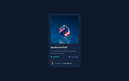
Submitted over 1 year agoA solution to the NFT preview card component challenge
nftPreviewCardComponent
@hmac100

Solution retrospective
What are you most proud of, and what would you do differently next time?
I think it turned out okay - don't currently know enough to assess how I'd do it differently - perhaps use Javascript for the overlay .
What challenges did you encounter, and how did you overcome them?The overlay was the main issue - not sure if I should say this - but checked out W3Schools and they had the exact solution for an overlay with icon using just HTML and CSS.
What specific areas of your project would you like help with?In this particular challenge I reckon the class naming could have been clearer , but generally speaking , other options for creating more concise code.
Code
Loading...
Please log in to post a comment
Log in with GitHubCommunity feedback
No feedback yet. Be the first to give feedback on Ham's solution.
Join our Discord community
Join thousands of Frontend Mentor community members taking the challenges, sharing resources, helping each other, and chatting about all things front-end!
Join our Discord