Not Found
Not Found
Not Found
Not Found
Not Found
Not Found
Not Found
Not Found
Not Found
Not Found
Not Found
Not Found
Not Found
Not Found
Not Found
Not Found
Not Found
Not Found
Not Found
Not Found

Submitted

NFT-preview-card-component

Dan 30

@txhawg

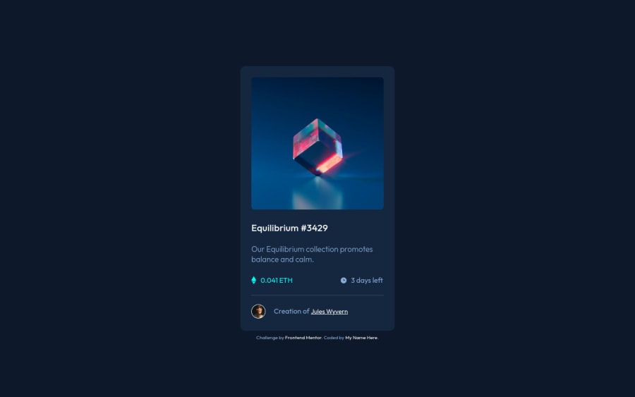
Desktop design screenshot for the NFT preview card component coding challenge

This is a solution for...

  • HTML
  • CSS
1newbie
View challenge

Design comparison


SolutionDesign

Solution retrospective


I made a few dumb mistakes along the way to solving this. First I couldn’t get my flex item centered, then I realized I didn’t give it any height. Next was changing the picture on hover. I must have tried 6 different ways before finding the unbelievably simple solution to that. I have to work on generating cleaner code, but I think I did pretty well here. The biggest problem I had was aligning the text and images, like on the price line. Is there a better way than just trial and error?

Community feedback

Elaine 11,400

@elaineleung

Posted

Hey Dan, this looks pretty good! And I'm sure that even though the mistakes caused some frustration, they also helped you learn a lot along the way, judging by how well you did here 🙂

About aligning those icons and the text in your auction container, what I did for my solution is to use flexbox. In your case, I'd give the auction container a display: flex with justify-content: space-between, and then for both the price and time selectors, I'd give them a display: flex and align-items: center. I'd remove any padding you've given to the children elements, and you also might want to check the line height as that could make things a bit off centered vertically as well (or help with it, depending on the value).

I got two small suggestions for you that might save you some frustration next time:

  1. Use CSS normalize/reset rules for every project. You already have the box-sizing and margins/padding star selector rule, so that's a start. You can also add this one for images, which you can add just under the star selector rule you have:

    img, svg, picture {
       max-width: 100%;
       display: block;
    }
    

    If you add that, you'll find that even if you remove the width from your image, things won't look too terrible. Try removing those rules and see what happens to your image if you have no width set on it!

  2. I saw you using some rather creative ways to solve this challenge, and I think if there's one thing I can suggest by looking at your code, it's that you can try using responsive size properties (e.g., min(), clamp(), min/max width) instead of setting a fixed width/height on your elements. You can read more about responsive properties here in this article by web.dev.

You can also a look at my solution and see whether that gives you some ideas on what you can do for your next challenge: https://www.frontendmentor.io/solutions/reponsive-nft-preview-component-W2gWx-dAyA

Best of luck, and keep going! 😊

Marked as helpful

0

Dan 30

@txhawg

Posted

@elaineleung Thank you Elaine, for the informative and thoughtful recommendations!

0

Please log in to post a comment

Log in with GitHub
Discord logo

Join our Discord community

Join thousands of Frontend Mentor community members taking the challenges, sharing resources, helping each other, and chatting about all things front-end!

Join our Discord