Not Found
Not Found
Not Found
Not Found
Not Found
Not Found
Not Found
Not Found
Not Found
Not Found
Not Found
Not Found
Not Found
Not Found
Not Found
Not Found
Not Found
Not Found
Not Found
Not Found

Submitted

nft-preview-card This one was a walkthrough for me.

@BankoleCaleb

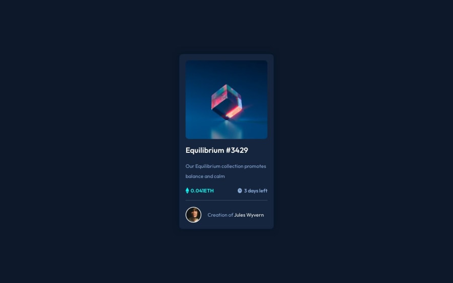
Desktop design screenshot for the NFT preview card component coding challenge

This is a solution for...

  • HTML
  • CSS
1newbie
View challenge

Design comparison


SolutionDesign

Solution retrospective


All suggestions are welcome.

Community feedback

@0xabdulkhaliq

Posted

Hello there 👋. Congratulations on successfully completing the challenge! 🎉

  • I have other recommendations regarding your code that I believe will be of great interest to you.

HEADINGS ⚠️:

  • This solution consists incorrect usage of headings so it can cause severe accessibility errors due to incorrect usage of level-one headings
  • Every site must want only one h1 element identifying and describing the main content of the page.
  • An h1 heading provides an important navigation point for users of assistive technologies, allowing them to easily find the main content of the page.
  • In this solution there's <h2> element which is this <h2>Equilibrium</h2>, you can preferably use <h1> instead of <h2>. Remember <h1> provides an important navigation point for users of assistive technologies so we want to use it wisely
  • So we want to add a level-one heading to improve accessibility.
  • Example:
<h1 class="white">
   <a href="#" class="white hover">Equilibrium #3429</a>
</h1>

.

I hope you find this helpful 😄 Above all, the solution you submitted is great !

Happy coding!

Marked as helpful

0
Shivraj K 400

@Shivraj-K09

Posted

The HTML and CSS code looks well-structured and commented, which is great for readability and maintainability.

  • In terms of the responsive design, it seems like you are trying to use a media query to make the layout responsive for screens wider than 500px. However, the syntax for your media query is incorrect. Instead of @media (width > 500px), it should be @media (min-width: 500px). Also, remember to include the appropriate closing tag (}) to close the media query.
  • Additionally, it might be helpful to add some responsive styling to the .image class to adjust the height property and maintain aspect ratio for different screen sizes.

Overall, great job on the code and Happy Coding 😉

0

Please log in to post a comment

Log in with GitHub
Discord logo

Join our Discord community

Join thousands of Frontend Mentor community members taking the challenges, sharing resources, helping each other, and chatting about all things front-end!

Join our Discord