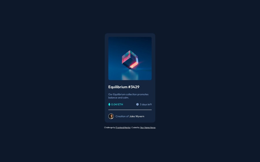
Design comparison
SolutionDesign
Solution retrospective
I appreciate it if anyone can comment my project :) Thank you
Community feedback
- @danielmrz-devPosted 12 months ago
Hello
Your project looks great!
About the hover effect on the image, it's a bit tricky, but here's how you can do it:
HTML
<img src="images/image-equilibrium.jpg" alt="Equilibrium" class="pic">
    <div class="icon">
      <img src="images/icon-view.svg" alt="icon-view" class="icon-view">
    </div>
CSS
         .pic {
            width: 300px;
            background: url('images/icon-view.svg') center center no-repeat;
            background-color: $Cyan-hover;
            background-size: cover;
            margin: auto;
            border-radius: 10px;
        }
        .icon {
            display: grid;
            justify-content: center;
            align-items: center;
            position: absolute;
            opacity: 0;
            background-color: $Cyan-hover;
            width: 300px;
            height: 300px;
            border-radius: 10px;
        }
            icon:hover {
                opacity: .5;
                cursor: pointer;
            }
Just don't forget to change the class names to match your project's.
-
headerandfooterare macro tags, they mean header and footer of the page. They are not used inside other elements. You can replace your header and footer withdivs. -
Also, you can add a
hover effecton theh1and thenameof the creator.
I hope it helps!
Other than those little details, you did a great job!
Marked as helpful0 -
Please log in to post a comment
Log in with GitHubJoin our Discord community
Join thousands of Frontend Mentor community members taking the challenges, sharing resources, helping each other, and chatting about all things front-end!
Join our Discord
