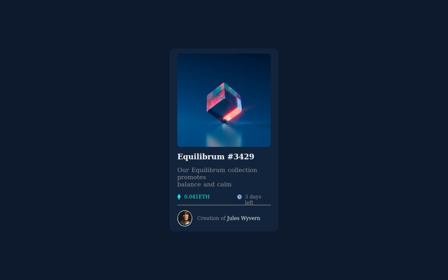
Not Found
Not Found
Not Found
Not Found
Not Found
Not Found
Not Found
Not Found
Not Found
Not Found
Not Found
Not Found
Not Found
Not Found
Not Found
Not Found
Not Found
Not Found
Not Found
Not Found

Submitted

NFT-PREVIEW-CARD

@Cmdliner

Desktop design screenshot for the NFT preview card component coding challenge

This is a solution for...

  • HTML
  • CSS
1newbie
View challenge

Design comparison


SolutionDesign

Solution retrospective


Please, if you have any suggestions on how i could make the code better or cleaner drop your suggestions.

Community feedback

Travolgi 🍕 31,420

@denielden

Posted

Hi Adeyemi, I took some time to look at your solution and you did a great job!

Also I have some tips for improving your code:

  • add main tag and wrap the card for Accessibility
  • remove all margin from card class because with flex they are superfluous
  • try to add a little transition on the element with hover effect
  • instead of using px try to use relative units of measurement -> read here

Overall you did well :)

Hope this help and happy coding!

Marked as helpful

0

@Cmdliner

Posted

@denielden Thanks for taking a look into my solution and pointing out my mistakes. I'll make sure to look into all waht you've said.

1
Dev Rathore 2,600

@GitHub-dev12345

Posted

Good Work Bro, but do small changes in text-content: Go to styleGuide and check the font-family and font-size , then apply your project 😊👍

I hope you find this helpful

Marked as helpful

0
PhoenixDev22 16,950

@PhoenixDev22

Posted

Hello @Adeyemi-Abiade ,

I have some suggestions regarding your solution:

  • Wrap the body content in main landmark.

  • You can remove the extra container class="card_bg_container".

  • Remove the margin:auto from the class="card". no need for it as you are using the flexbox.

  • Anything with a hover style in design means it's interactive. you need to add an interactive element<a> around the image Equilibrium #3429 and Jules Wyvern .

  • Page should contain a level-one heading . In this challenge , you can use <h1> to wrap Equilibrium #3429. For future use , Heading levels should only increase by one.

  • No need for <br> , you can use margin and padding for spacing.

  • For any decorative images, each img tag should have empty alt="" (as you did )and aria-hidden="true" attributes to make all web assistive technologies such as screen reader ignore those images in( icon-view, icon-ethereum, icon-clock ).

  • The avatar 's alt shouldn't be The Design's Creator. It's meaningless , you can set Jules Wyvern to it.

  • Read more how to write an alt text

  • the icon-view doesn't really need to be in the html, you could do it with css. If you want it to stay in html it needs to be aria-hidden or role presentation with empty alt.

  • the link should be wrapping the main image and either have Sr-only text, an aria-label or alt text that says where that link takes you.

  • I would leave the equilibrium main img in html and use pseudo-elements to change the teal bg color to a hsla. Then opacity can be changed from 0 to 1 on the pseudo on hover.

  • You can use an unordered list<ul> to wrap class="eth-time-bar" and in each <li>, there would be <img > and<p> .


        <ul  class="wallet-stats">
            <li class="wallet-info">
               <img src='./images/icon-ethereum.svg' alt="" aria-hidden="true"/>
               <p class="coin--text">0.041 ETH</p>
            </li>
            <li class="wallet-info">
               <img src='./images/icon-clock.svg'/ alt="" aria-hidden="true">
               <p class="time--text">3 days left</p>
            </li>
        </ul>
  • No need for <hr> , you can use border-top: to the class="author-info"

  • width: 350px; an explicit width is not a good way . Remove the width from the card .That will let it shrink a little when it needs to.

  • To center the card on the middle of the page , you can use the flexbox properties and min-height: 100vh for the <body> not the class="card-bg-container"like this:

body{
display:flex;
align-items: center;
justify-content: center;
width: 100%;
min-height: 100vh;/*using vh (viewport height) units to allow the body to set a minimum height value based upon the full height of the viewport.This also allows the body to to grow taller if the content outgrows the visible page.*/


.img_cont{
    max-width: 100%;/** no need to set an explicit width/
    min-height: 300px;
    /* margin: 0 auto; */ remove the margin 
:
:
}

Overall, your solution is good, Hopefully this feedback helps.

0

Please log in to post a comment

Log in with GitHub
Discord logo

Join our Discord community

Join thousands of Frontend Mentor community members taking the challenges, sharing resources, helping each other, and chatting about all things front-end!

Join our Discord