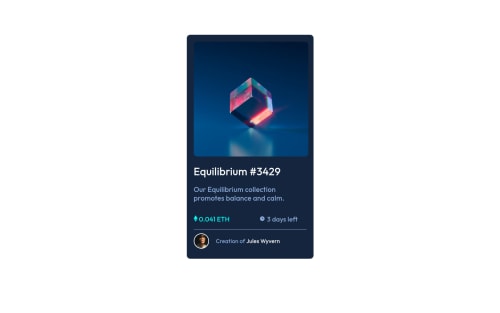
Design comparison
Community feedback
- @VCaramesPosted about 2 years ago
Hey @Nasir222222, some suggestions to improve you code:
-
The background color was not applied. Fix this.
-
There is no need to have two images for this challenge and the Picture Element is being used incorrectly.
-
The NFT Alt Tag description needs to be improved upon. You want to describe what the image is; they need to be readable. Assume you’re describing the image/icon to someone.
-
There is only one heading in this challenge and that goes the NFT title, "Equilibrium #3429”. Everything else gets wrapped in a Paragraph Element.
-
The "NFT image", "Equilibrium #3429" and "Jules Wyvern" in an Anchor Tags <a>. The anchor tag will allow users to click on content and have them directed to another part of your site
-
The Icons serve no other purpose than to be decorative; They add no value. Their Alt Tag should left blank and have an aria-hidden=“true” to hides it from assistive technology.
-
A lot of the headaches and and repeated properties can be be overcome by implementing a proper CSS Reset.
Here are few CSS Resets that you can look at and use to create your own or just copy and paste one that is already prebuilt.
https://www.joshwcomeau.com/css/custom-css-reset/
https://meyerweb.com/eric/tools/css/reset/
http://html5doctor.com/html-5-reset-stylesheet/
Happy Coding!
0 -
Please log in to post a comment
Log in with GitHubJoin our Discord community
Join thousands of Frontend Mentor community members taking the challenges, sharing resources, helping each other, and chatting about all things front-end!
Join our Discord