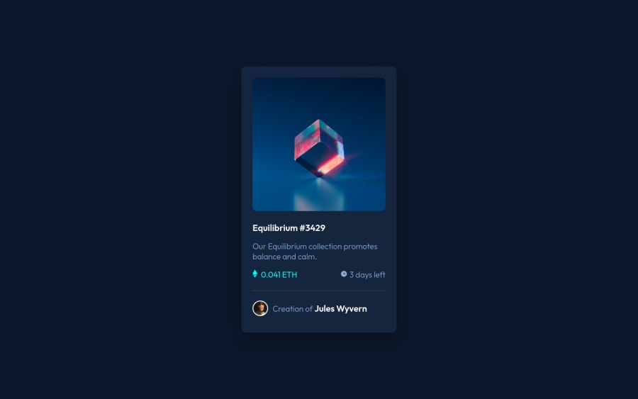
Design comparison
Solution retrospective
It took me time, but I did it finally. I frequently use flex display, please recommend something better to start use and learn, because I feel that there's a better way.
Community feedback
- @correlucasPosted about 2 years ago
👽Hello again my friend, Eliot, congratulations for your new solution!
I've one rule about
GRID
andFLEX
for complex layouts I useGRID
and styling simple components I useflex
. This challenge is the classic case where you can get done using flex andflex-direction: column
to order the content and usegap
to make the spacing between elements.**“Control can sometimes be an illusion
- MR ROBOT“ Control can sometimes be an illusion... UNLESS YOU USE FLEXBOX"
- LUCASSome months ago when I started I read a lots about grid and flex, I'll let you really good resources to learn that I helped me in the past:
🐸THE BEST RESOURCE TO LEARN POSITION WITH FLEX: https://flexboxfroggy.com/
👽THE BEST GUIDE FOR FLEXBOX: https://css-tricks.com/snippets/css/a-guide-to-flexbox/
👽THE BEST GUIDE FOR COMPLEX LAYOUTS WITH GRID: https://gridbyexample.com/examples/
Here's my solution for this challenge if you wants to see how I build it: https://www.frontendmentor.io/solutions/nft-preview-card-vanilla-css-custom-design-and-hover-effects-b8D1k9PDmX
👋 I hope this helps you and happy coding!
Marked as helpful1@AvatarxAangPosted about 2 years ago@correlucas Thanks alot my friend, I really appreciate your feedback, and thanks for providing me with resources so that I can develop my skills. The second quote by you was perfect 😂 I want to thank you again for your help, I really need feedback to improve.
0@AvatarxAangPosted about 2 years ago@correlucas Thanks alot my friend, I really appreciate your feedback, and thanks for providing me with resources so that I can develop my skills. The second quote by you was perfect 😂 I want to thank you again for your help, I really need feedback to improve.
0 - @ErayBarslanPosted about 2 years ago
Hey there, excellent work on this one, congrats! Your solution is clean and flex is totally fine. For layout you'll end up using either
flex
orgrid
. They both can achieve similar things but one does certain things easier than other. To be honest unless I need to usegrid
, i go withflex
since it gives me more flexibility :) Some suggestions I can give:- Avoid giving
height
to containers. It won't matter much in a such project but by the time you work on bigger/dynamic pages you might end up dealing with overflowing issues. Let the child elements, margin, padding etc. define it's parent's height. In this challenge you can remove both heights from.card
and.container
and won't break the design. Only gotcha here would be overlay overflowing out of image and you can display it as block to prevent that:
.container img{ width: 100%; border-radius: 0.625rem; display: block; }
- For semantic markup, you should use landmark containers instead <div>. To achieve this you can change .card element to
<main class="card">
- Per page we should place a
<h1>
for accessibility and better SEO results. You can place it as :<h1><a href="#">Equilibrium #3429</a></h1>
This makes it last of my suggestions, happy coding :)
Marked as helpful1 - Avoid giving
Please log in to post a comment
Log in with GitHubJoin our Discord community
Join thousands of Frontend Mentor community members taking the challenges, sharing resources, helping each other, and chatting about all things front-end!
Join our Discord