Not Found
Not Found
Not Found
Not Found
Not Found
Not Found
Not Found
Not Found
Not Found
Not Found
Not Found
Not Found
Not Found
Not Found
Not Found
Not Found
Not Found
Not Found
Not Found
Not Found

Submitted

NFT-Card-Preview

Zeeshan 30

@Zeeshanalt

Desktop design screenshot for the NFT preview card component coding challenge

This is a solution for...

  • HTML
  • CSS
1newbie
View challenge

Design comparison


SolutionDesign

Community feedback

@VCarames

Posted

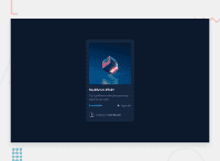
Hey @Zeeshanalt, some suggestions to improve you code:

  • Your “NFT image” needs an Alt Tag. It should describe what the image is; it need to be readable. Assume you’re describing the image to someone.

  • Wrap the "NFT image", "Equilibrium #3429" and "Jules Wyvern" in an Anchor Tags <a>. The anchor tag will allow users to click on content and have them directed to another part of your site.

  • Add max-width: 350px to your card container to make it responsive.

  • Change the width to max-width 100% in your image to make it responsive.

  • Increase the padding to your card container to make it look more like the FEM example.

Happy Coding! 👻🎃

0
Lucas 👾 104,420

@correlucas

Posted

👾Hi @Zeeshanalt, congratulations on your solution!👋 Welcome to the Frontend Mentor Coding Community!

Great solution and a great start! From what I saw you’re on the right track. I’ve few suggestions for you that you can consider adding to your code:

  • Use <main> instead of a simple <div> this way you improve the semantics and accessibility showing which is the main block of content on this page. Remember that every page should have a <main> block and that <div> doesn't have any semantic meaning.
  • The main heading has the tag <h2>, in this case, you should replace it with <h1> since this heading is the main title on this page. Remember that every page should have one <h1> to declare which is the most important title and that you should follow the hierarchy using the heading sequence (h1, h2, h3, h4, h5) and never jump a level.
  • Add a margin of around margin: 20px to avoid the card touching the screen edges while it scales down.
  • Use relative units as rem or em instead of px to improve your performance by resizing fonts between different screens and devices. These units are better to make your website more accessible. REM does not just apply to font size, but to all sizes as well.

Here's how you can add the hover effect:

Container needed to position the overlay. Adjust the width as needed

.container {
  position: relative;
  width: 100%;
  max-width: 340px;
}

Make the image to responsive

.image {
  width: 100%;
  height: auto;
}

The overlay effect (full height and width) - lays on top of the container and over the image

.overlay {
  position: absolute;
  top: 0;
  bottom: 0;
  left: 0;
  right: 0;
  height: 100%;
  width: 100%;
  opacity: 0;
  transition: .3s ease;
  background-color: red;
}

When you mouse over the container, fade in the overlay icon

.container:hover .overlay {
  opacity: 1;
}

The icon inside the overlay is positioned in the middle vertically and horizontally .icon { color: white; font-size: 100px; position: absolute; top: 50%; left: 50%; transform: translate(-50%, -50%); -ms-transform: translate(-50%, -50%); text-align: center; }

When you move the mouse over the icon, change color

.icon-eye:hover {
  color:  hsl(178, 100%, 50%, 0.5);;
}

👨‍💻Here's my solution for this challenge if you wants to see how I build it: https://www.frontendmentor.io/solutions/nft-preview-card-vanilla-css-custom-design-and-hover-effects-b8D1k9PDmX

✌️ I hope this helps you and happy coding!

0

Please log in to post a comment

Log in with GitHub
Discord logo

Join our Discord community

Join thousands of Frontend Mentor community members taking the challenges, sharing resources, helping each other, and chatting about all things front-end!

Join our Discord