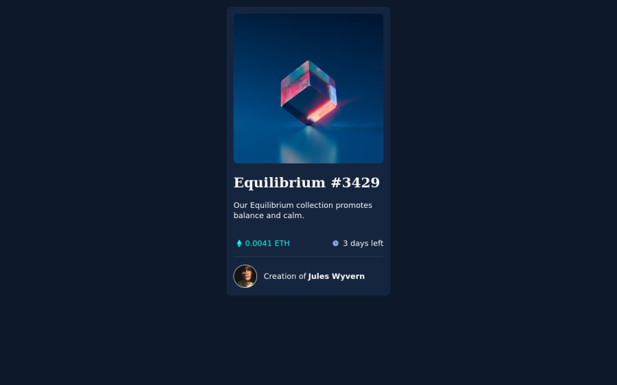
Design comparison
Solution retrospective
Hello guys, I hope you're doing great. Here is my project of today. I just had one issue: The eye (when you hover on the nft-image) has the opacity of the background div there. How do I fix this? If you find other issues please let me know. I appreciate your support :).
Hugs from the potato country Konstantin
Community feedback
- @AdrianoEscarabotePosted over 2 years ago
Hi Konstantin Christ, how are you?
I really liked the result of your project, but I have some tips that I think you will enjoy:
- To align some content in the center of the screen, always prefer to use
display: flex;it will make the layout more responsive!
Example:
body { margin: 0; padding: 0; display: flex; align-items: center; justify-content: center; min-height: 100vh; }- Consider using rem for font size .If your web content font sizes are set in absolute units, such as pixels, the user will not be able to re-size the text or control the font size based on their needs. Relative units “stretch” according to the screen size and/or user’s preferred font size, and work on a large range of devices.
if you want to continue coding with px, you can download a very useful extension in vscode, it converts px to rem! link -> px to rem
The rest is great!
I hope it helps... 👍
Marked as helpful0 - To align some content in the center of the screen, always prefer to use
- P@waldekglazPosted over 2 years ago
Hi Konstantin
Instead of
.background:hover{ opacity: .4; }Try setting background-color to rgba with opacity value, then your svg will have opacity: 1 and background will be semi transparent.I hope it helps.
Cheers
Marked as helpful0
Please log in to post a comment
Log in with GitHubJoin our Discord community
Join thousands of Frontend Mentor community members taking the challenges, sharing resources, helping each other, and chatting about all things front-end!
Join our Discord
