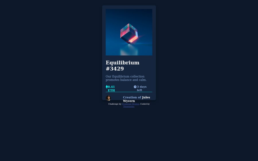
Design comparison
Solution retrospective
As a newbie, I had a serious challenge in putting my overlay, is there any advice on that? Anticipating your feedbacks.
Community feedback
- @Khadijarejjaoui99Posted over 2 years ago
Hello, nice work and congratulations for completing this challenge. Some suggestions for better result:
- To improve the accessibility try to use semantic elements like main element instead of div element.
- To center your cart try to add this code in the main-card class .main-card{ position: absolute; top: 50%; left: 50%; transform: translate(-50%, -50%) } or use this code in the body body{ height: 100vh; display: flex; align-items: center; justify-content: center; } I hope these suggestions help you. all the best and keep and the good work.
Marked as helpful0 - @ProgressOnyemaPosted over 2 years ago
The parent div holding everything(the image, equilibrium #3429, eth data, date and author section) should be given a “min-height”, then its display would be flex.
It would be very good to give the sections(image, equilibrium #3429, eth data, date and author) different divs in the parent div.
Hope this insight helps!
0
Please log in to post a comment
Log in with GitHubJoin our Discord community
Join thousands of Frontend Mentor community members taking the challenges, sharing resources, helping each other, and chatting about all things front-end!
Join our Discord
