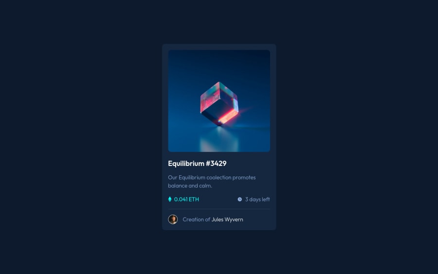
NFT-Card-Component raw HTML and CSS responsive across standard screens
Design comparison
Solution retrospective
I am new to front end development and am still curious if anyone can tell me if I am using max-width and width in the right context. I basically set all containers and containing elements a max width that is hardcoded in pixels and then the width is at 100%, so when things scale down to smaller screens there is no smushing but once it gets to bigger screens there is a max size put it. Any advice or tips would be greatly appreciated!
Community feedback
- @yishak621Posted almost 2 years ago
The max-width is generally usefull to use for parent container ..if there isn't any necessary case to use for elements inside don't use it...so the max-width should be greater than the width that u specified ...so when the width >max-width the browser will render the max width ....
Marked as helpful0
Please log in to post a comment
Log in with GitHubJoin our Discord community
Join thousands of Frontend Mentor community members taking the challenges, sharing resources, helping each other, and chatting about all things front-end!
Join our Discord
