

Design comparison

Solution retrospective
I am open for feedback :) So that I can fix my spaghetti code one day :)
Community feedback
- @denieldenPosted over 2 years ago
Hi Navarcus, great work on this challenge! 😉
Here are a few tips for improve your code:
- remove all
marginfrom.containerclass - use flexbox to the body to center the card
- after, add
min-height: 100vhto body because Flexbox aligns child items to the size of the parent container - instead of using
pxuse relative units of measurement likerem-> read here
Overall you did well 😁 Hope this help!
Marked as helpful1 - remove all
- @PhoenixDev22Posted over 2 years ago
Hello @navarcus ,
Congratulation on completing this frontend mentor challenge.
I have some suggestions regarding your solution:
-
Anything with a hover style in design means it's interactive. you need to add an interactive element
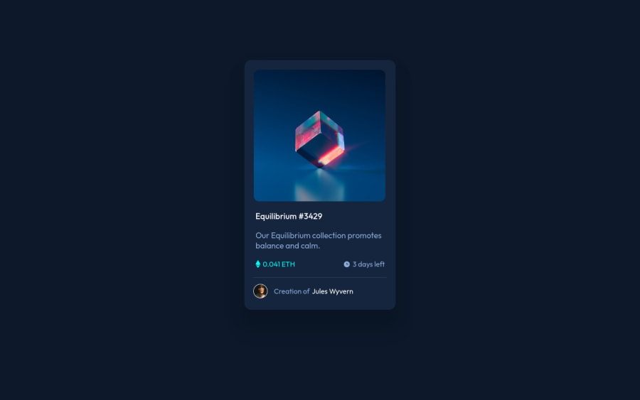
<a>around the image andEquilibrium #3429 and Jules Wyvern. -
For any decorative images, each img tag should have empty
alt=""as you did andaria-hidden="true"attributes to make all web assistive technologies such as screen reader ignore those images in(icon-view, icon-ethereum, icon-clock). -
The avatar's alt should not be profile pic, It's meaningless. You can use the creator's name
Jules Wyvern. Read more how to write an alt text
The link wrapping the equilibrium image should either have
Sr-onlytext, anaria-labeloralttext that says where that link takes you.- To use more semantic tags , you can use
<ul>to wrapclass="maincontent"and in each<li>there would be<img>and<p>(not a header)
You can use
<figure>and<figcaption >for the avatar's part.To center the card on the page, you may use flex or grid properties to the body and
min-height: 100vh. Then you can rremove the margins.width: 340px;an explicit width is not a good way . consider usingmax-widthto card instead and a little margin to the card .That will let it shrink a little when it needs to.
General points :
-
It's recommended to use
emandremunits .Bothemandremare flexible, Usingpxwon't allow the user to control the font size based on their needs. -
It's not recommended to use
pxfor font size.If the user tries to resize the text through his browser, any element with an absolute font size will not change, although any other element will. This prevents users from making your page's text larger if they need to see it more clearly, or smaller if they think it's too big. -
Really important to keep css specificity as low/flat as possible. The best way to do styling is single class selectors.
Overall , your solution is good. Hopefully this feedback helps.
Marked as helpful1 -
- @BerkePalamutcuPosted over 2 years ago
thank you for your time explaining me my mistakes. I will update the codebase respectfully ! :) Have a nice day ahead
0


Please log in to post a comment
Log in with GitHubJoin our Discord community
Join thousands of Frontend Mentor community members taking the challenges, sharing resources, helping each other, and chatting about all things front-end!
Join our Discord