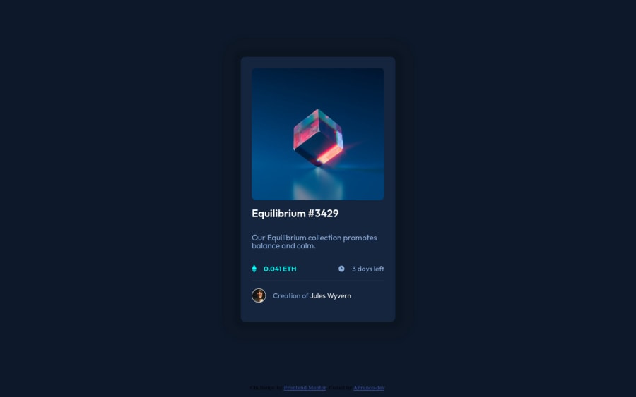
Design comparison
Solution retrospective
I fell my code is having to many lines, that I'm using too many div and that I'm making too many specific selections with CSS. Is what I have done average or should I make my code smaller?
Community feedback
- @AdrianoEscarabotePosted about 2 years ago
Hello Andre Franco!
Congrats on the challenge!
I have some tips for you:
1- I saw that you specified all the html elements in the css to just put a margin and padding and some other things a valuable tip is that you could have done it this way:
* { margin: 0; padding: 0; }
this way it will take all the html elements and apply the respective rules, making you save a lot of code lines.
2- put a padding around the body so that when the screen reaches lower resolutions it doesn't stay leaning against the edge.
3- try to use a responsive measurement unit for example percentage on smaller screens I recommend this because when the screen reaches 350px it starts to break, but you can adjust it maybe using a media query it's your choice to make this change, but it's a good practice.
But the rest is very good congratulations on the result. Congratulations 🥳
Marked as helpful2@AFranco-devPosted about 2 years ago@AdrianoEscarabote first of all thank you a lot for the feedback :)
1-I'll do it next time it is really smaller in terms of code.
2-I did not realized it so that is really a good thing to have in mind thank you for the tip.
3-Good practices are something that really matters so I will definitely do it from now on with the media query.
Again thank you a lot my friend! Have a nice day!:D
0 - @PhoenixDev22Posted about 2 years ago
Hello Andre Franco,
Excellent work! Congratulation on completing this challenge. I see you have received some incredible feedback . I have some suggestions regarding your solution if you don't mind:
HTML
- Since there's a :hover state on the image and means it's interactive, So there should be an interactive element around it. When you create a component that could be interacted with a user , always remember to include interactive elements like(button, textarea,input, ..) For this imagine what would happen when you click on the image, there are two possible ways:
1: If clicking the image would show a popup where the user can see the full NFT, here you use
<button>
.2:If clicking the image would navigate the user to another page to see the NFT, here use
<a>
.- Also use
<a>
to wrapJules Wyvern and Equilibrium #3429
- Never use
<div>
and<span>
alone to wrap a meaningful content. Just keep in mind that you should usually use semantic HTML in place of the div tag unless none of them (the semantic tags) really match the content to group together. By adding semantic tags to your document, you provide additional information about the document, which aids in communication.
- The link wrapping the equilibrium image (
image-equilibrium
) should either haveSr-only
text, anaria-label
oralt
text on the image that indicates where the link navigate the user.
- For any decorative images, each img tag should have empty
alt=""
as you did and addaria-hidden="true"
attributes to make all web assistive technologies such as screen reader ignore those images in(icon-view, icon-ethereum, icon-clock
).
- You can use unordered list
<ul>
to wrap the inner part of the component. In each<li>
should be<img>
and ``<p>`, then you may use flex properties to align them centrally.
- The avatar's alt should not be empty . You can use the creator's name
Jules Wyvern
. Read more how to write an alt text
- To use more semantic tags , you may use
<figure>
and<figcaption>
for the avatar's part.
- There are so many ways to add the hover effect on the image , The one I would use, using pseudo-elements to change the teal bg color to a hsla. Then opacity can be changed from 0 to 1 on the pseudo element on hover. The icon view doesn’t really need to be in the HTML as there no need for another clutter in HTML. You can use CSS for it.
Last, there are are some extra
<div>
, they should be removed.Aside these, your solution is great. Hopefully this feedback helps
Marked as helpful0@AFranco-devPosted about 2 years ago@PhoenixDev22 I'm really sorry for the late response! But I'm gonna say that you just have given me the most complete and most useful feedback I have been given! Thank you a lot for that in advance :D
1-the next time I won't forget to add someway to interact with the next interactive component I code and yes I will add for the next challenge a way to see the complete element on click.
2-I have just started to study about SEO and I really won't forget to add the respective links to the page.
3-I will use from now on every respective HTML tag for every part of every website I build from now on.
4-I won't forget to add sr-only elements neither.
5-And I will also add the aria-hidden=true on every decorative element.
6-for anything that resembles something like a list I will use <ul> tag for describing it.
7-I have just read the blog and I will definitely be better with the alt attribute
8-Ok I will use the figure tag the next time.
9-I did not completely understand what you mean with the icon view does not really needed to be in HTML.
Your feedback really helped me! Thank you again have a nice day!
0 - @MichaelDWilliams1Posted about 2 years ago
It appears you wanted to uniform certain attributes.... So instead typing them all out individually just use the "*" like so: *{
margin: 0; padding: 0; border: 0; font-size: 100%; font: inherit; vertical-align: baseline; } Also something i do if i have a group that i want to behave the same such as where you typed out a bunch of tags and made them all "display: block;" Instead try giving them all the same class name. This way you wont have to type out each tag individually.I hope this was helpful! Good job on this project by the way. It looks great!
Marked as helpful0@AFranco-devPosted about 2 years ago@MichaelDWilliams1 Thank you! I will do so for any other behavior that I'd repeat :)
0
Please log in to post a comment
Log in with GitHubJoin our Discord community
Join thousands of Frontend Mentor community members taking the challenges, sharing resources, helping each other, and chatting about all things front-end!
Join our Discord