Not Found
Not Found
Not Found
Not Found
Not Found
Not Found
Not Found
Not Found
Not Found
Not Found
Not Found
Not Found
Not Found
Not Found
Not Found
Not Found
Not Found
Not Found
Not Found
Not Found

Submitted

NFT using Flex

RazvanTSG 150

@RazvanTSG

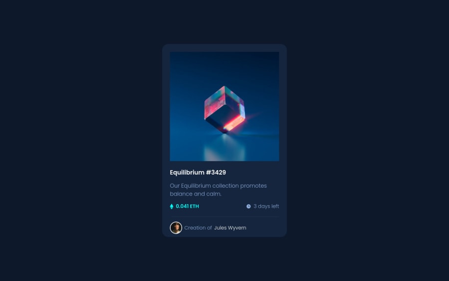
Desktop design screenshot for the NFT preview card component coding challenge

This is a solution for...

  • HTML
  • CSS
1newbie
View challenge

Design comparison


SolutionDesign

Solution retrospective


I think I did pretty good. I can't figure out why border-radius didn't work for the image though :(

Community feedback

@jrleijnse

Posted

Hey there! Great job completing this challenge! 🎊

I have some suggestions for your code that might interest you.

HTML 📄:

  • Instead of using the <div> tag for your containers, try using some semantic HTML to provide more meaning to it, for better SEO. For example, instead of using <div> you could use the <main> or <section> tag. For the element with the classname attribution you could use the <footer> tag.
  • Always provide an <img> with a descriptive ALT text. This makes your project more accessible to people using screen readers and SEO.

CSS 🎨:

  • To make your project more responsive and adaptable (in this case as well: especially when you start building bigger and bigger projects), I would suggest to use rem instead of px. This basically means that all sizing will be calculated in relation to the root element (rem). To set the standard font-size for the root element, you can provide a font-size inside the HTML element inside your CSS. For example: html {font-size: 15px;}.

For more information on this topic, you can read the following article: PX or REM in CSS? 📘

  • To make your solution responsive for different devices and screen widths, you can create a media query inside your CSS file and set the breaking point (i.e. the moment your media query gets triggered based on the width of the viewport). For example: @media (max-width: 375px) { ***Place your CSS code here, just like you would in a regular CSS file***}.

For more information on this topic, you can read the following article: Media queries 📘

  • An easy way to quickly and automatically center your <main> element inside the <body> of your page, is by setting the following properties onto the <body> element inside your CSS like so: body { min-height: 100vh; display: flex; flex-direction: column; justify-content: center; align-items: center; }

I hope you find my suggestions useful, and above all: the solution you provided is very good!

Keep it up and happy coding! 😃

Marked as helpful

1

RazvanTSG 150

@RazvanTSG

Posted

@jrleijnse Thank you so much!

1
Jen Gori 170

@jengori

Posted

If you set the border-radius property for the image rather than the div that the image is contained in, this should solve your border-radius problem.

Marked as helpful

0

RazvanTSG 150

@RazvanTSG

Posted

@jengori This might be it. Thanks!

0

Please log in to post a comment

Log in with GitHub
Discord logo

Join our Discord community

Join thousands of Frontend Mentor community members taking the challenges, sharing resources, helping each other, and chatting about all things front-end!

Join our Discord