Not Found
Not Found
Not Found
Not Found
Not Found
Not Found
Not Found
Not Found
Not Found
Not Found
Not Found
Not Found
Not Found
Not Found
Not Found
Not Found
Not Found
Not Found
Not Found
Not Found

Submitted

NFT Responsive Card Component

@TrenyceCodes

Desktop design screenshot for the NFT preview card component coding challenge

This is a solution for...

  • HTML
  • CSS
1newbie
View challenge

Design comparison


SolutionDesign

Solution retrospective


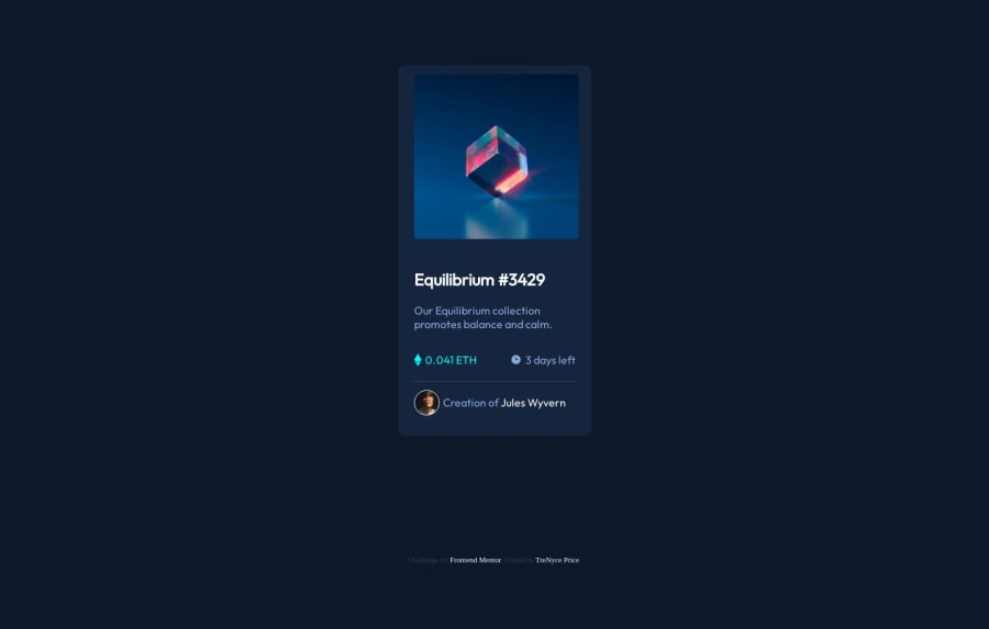
Hey Frontend Community. I just finished another challenge. So far Im improving on margins and understanding them better. I even learned about @font-face, a beneficial helpful CSS attribute. If you have any feedback on how I can improve my code, do let me know.

Community feedback

@0xabdulkhaliq

Posted

Hello there 👋. Congratulations on successfully completing the challenge! 🎉

  • I have other recommendations regarding your code that I believe will be of great interest to you.

CSS 🎨:

  • Looks like the <footer"> element has not been properly placed at bottom using. So let me explain, How you can place the component at bottom with using fixed positioning for footer
  • Luckily you already used [Grid] layout of css to center the component, So you just want to add fixed position for <footer> element to place it in bottom of the page
footer {
   position: fixed;
   bottom: 1em;
}
  • Now your component has been properly at bottom

.

I hope you find this helpful 😄 Above all, the solution you submitted is great !

Happy coding!

Marked as helpful

1

@TrenyceCodes

Posted

@0xAbdulKhalid thanks you. I will definitely update my code tomorrow

Happy Coding

0

@TrenyceCodes

Posted

@0xAbdulKhalid I actually have a question. How could I make my designs responsible to mobile devices

0

@0xabdulkhaliq

Posted

That's a nice question @Neice76!

LET ME ANSWER IT 💡:

  • To make our site responsive i would greatly suggest to go with mobile first workflow
  • To design a mobile-responsive website using a mobile-first workflow, you should start by designing the site for mobile devices first, ensuring that it is optimized for smaller screens and touch-based interactions.
  • This approach involves designing for the smallest screen size first and then gradually adding more complexity as the screen size increases
  • We can also have less headache because if we develop our web application in desktop first workflow then we need to disable some elements manually after the build, it's sort of headache. But when we go with mobile first workflow we can escape from it (personal experience for me & other fellow developers)
  • Let me share the css boilerplate:
<-----
Your mobile first css rules
----->

@media (min-width: 56.25em) {   --- DESKTOP --

<-----
Writing styles for Desktops
----->

}

Hope this feedback will be helpful to you

Marked as helpful

0

@TrenyceCodes

Posted

@0xAbdulKhalid this is very helpful. Thank you

0

@0xabdulkhaliq

Posted

Glad you found it helpful @Neice76! 🤠

1

Please log in to post a comment

Log in with GitHub
Discord logo

Join our Discord community

Join thousands of Frontend Mentor community members taking the challenges, sharing resources, helping each other, and chatting about all things front-end!

Join our Discord