Design comparison
Solution retrospective
Hi everyone!
I hope this message finds you well.
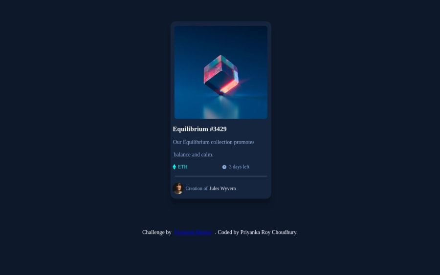
Here is my NFT Product Component Project. I have faced some challenges in this project.
Here is a breakdown of the challenges:
- For example, I was trying to set the responsiveness of the screen for mobile and desktop, but the nft card was not responding to the width of the screen size.
- I was trying to set the hover state for the eye icon, which I was able to achieve but I wanted the background image colour to be changed too which I need help
- Any other feedback will be greatly appreciated. Your considered feedback is of great importance to me, and I genuinely look forward to your expert insights. Thank you for your time.
Warm regards,
Priyanka
Community feedback
- @gfunk77Posted about 1 year ago
Nice job on your nft card.
-
I’d say first, format your html. It makes it easier to read and especially easier for others to look at. Just select everything and right click. You should see an option to ‘format code’.
-
Also, you have a spelling error in your css - image-contaciner:hover. Investigate that first to see if it solves any issues.
-
You can also play around with the
display: none and display: blockproperties to help with isolating your eye from the background. Your eye should only appear in the hover state so check out block/none.
Congrats on your solution it looks great.
0 -
Please log in to post a comment
Log in with GitHubJoin our Discord community
Join thousands of Frontend Mentor community members taking the challenges, sharing resources, helping each other, and chatting about all things front-end!
Join our Discord
