Design comparison
SolutionDesign
Solution retrospective
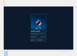
I tried my best to make it look like the design but I feel like I might have messed up the text size or the dark bluish shape behind the card. Any help would be welcome!
Community feedback
- @GodILoveTequilaPosted almost 3 years ago
Hello, good job finishing this one! I have found some issues you can easily fix. It would be a good idea to think about the context and put everything into a section or main ( depending on what you're building). Also will be better to use css for applying width to the elements. Also you can have a look at flex box-> justify-items, so you can align items in the center. Keep it going. cheers!
0
Please log in to post a comment
Log in with GitHubJoin our Discord community
Join thousands of Frontend Mentor community members taking the challenges, sharing resources, helping each other, and chatting about all things front-end!
Join our Discord
