Design comparison
SolutionDesign
Solution retrospective
idk is there a better, more efficient way to get a good design
Community feedback
- @shashreesamuelPosted over 2 years ago
Hey good job completing this challenge.
Keep up the good work
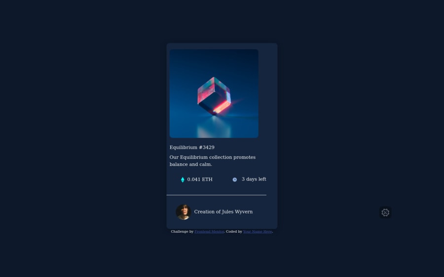
Your solution looks great however I think the image in your card is supposed to be stretched and have a bit of padding around. Secondly the card title needs to be a heavier font weight
I hope this helps
Cheers Happy coding 👍
0 - @zoleee98Posted over 2 years ago
you can make a flexbox from your card and therefore you can position things easily, just like you did with your body element
0
Please log in to post a comment
Log in with GitHubJoin our Discord community
Join thousands of Frontend Mentor community members taking the challenges, sharing resources, helping each other, and chatting about all things front-end!
Join our Discord
