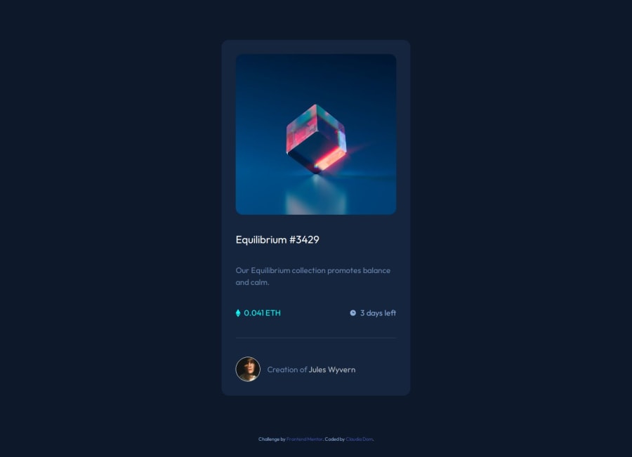
Design comparison
SolutionDesign
Community feedback
- P@jayeheffernanPosted 9 days ago
Looks good. Gets awkward around 700px width. I implemented the "Active" states as if the whole card is one single clickable item, but I think you're probably correct to have image/title/author as 3 separate active states
0
Please log in to post a comment
Log in with GitHubJoin our Discord community
Join thousands of Frontend Mentor community members taking the challenges, sharing resources, helping each other, and chatting about all things front-end!
Join our Discord
