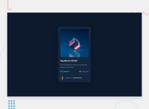
Design comparison
SolutionDesign
Community feedback
- @fernandolapazPosted over 1 year ago
Hi 👋, perhaps some of this may interest you:
HTML / ACCESSIBILITY:
- The main content of every page (the card in this case) should be wrapped with the
<main>tag.
- Instead of wrapping each element with a
<div>, better to use semantic elements like<h1>or<p>.
- The Equilibrium image is meaningful and in case the user can't see it, the
alttext should give a description.
- You forgot to add the hover states for the interactive elements.
CSS:
- In addition to resetting the
box-sizinglike you did, it is also good practice to remove margins and padding to have a clean starting point and reduce differences between browsers:
* {
box-sizing: border-box;
margin: 0;
padding: 0;
}
This will remove the vertical scroll bar you have for example.
- You might consider using relative units like rem or em since they are better for scalable layouts. Something simple to start with would be to convert to rem (1 rem equals the font size of the root element, 16px by default). Consider this suggestion especially for the
font-size.
I hope you find it useful, any questions do not hesitate : )
Regards,
Marked as helpful0@hikkenoace1Posted over 1 year agothanks a lot can you explain to me why the <hr> element shows up like a dot here not as a horizontal line? @fernandolapaz
1@fernandolapazPosted over 1 year ago@hikkenoace1
Hi,
It shows that way because of the
flexcontainer I think.But you could give it a
widthin percentage with respect to the 'container', something like 90% maybe.Marked as helpful0 - The main content of every page (the card in this case) should be wrapped with the
Please log in to post a comment
Log in with GitHubJoin our Discord community
Join thousands of Frontend Mentor community members taking the challenges, sharing resources, helping each other, and chatting about all things front-end!
Join our Discord
