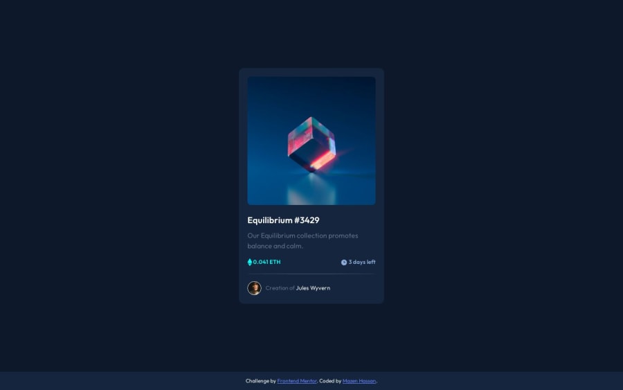
Design comparison
Solution retrospective
Hi. This project was great to learn pseudo class and pseudo elements, it was challenging to get it right the first time but finally got it working and understood more about pseudo classes implementation.
Resources that helped:
NFT Guide on Discord Community
Any feedback on improvement is greatly appreciated :)
Community feedback
- @AGutierrezRPosted 11 months ago
Hello there 👋. Good job on completing the challenge!
I have some suggestions about your code that might interest you.
CSS and Styling:
- Implement CSS custom properties to define and utilize project colors more easily.
Accessibility and Semantic HTML:
- The icons are decorative, so their alt text must be empty:
alt="". - Profile image could benefit from a more descriptive alt text, like
alt="Headshot of Jules Wyvern". - Consider wrapping the
<a>with<h2>this helps screen reader users to find the card title and know that it is a title and an anchor.
I hope you find this helpful 😁. Most importantly, your submitted solution is fantastic!
Happy coding!
Marked as helpful1@Mazz100Posted 11 months ago@AGutierrezR Hi. Thanks for your great feedback!
-
I'm using SASS for styling and I got variables that works just like CSS custom properties, I just noticed that I hardcoded the main BG on body so I fixed that. Thanks.
-
I got notes of your accessibility and modified my code accordingly, thanks so much for the valuable tips.
I appreciate your response and will gladly refer back to it anytime needed. :)
1
Please log in to post a comment
Log in with GitHubJoin our Discord community
Join thousands of Frontend Mentor community members taking the challenges, sharing resources, helping each other, and chatting about all things front-end!
Join our Discord
