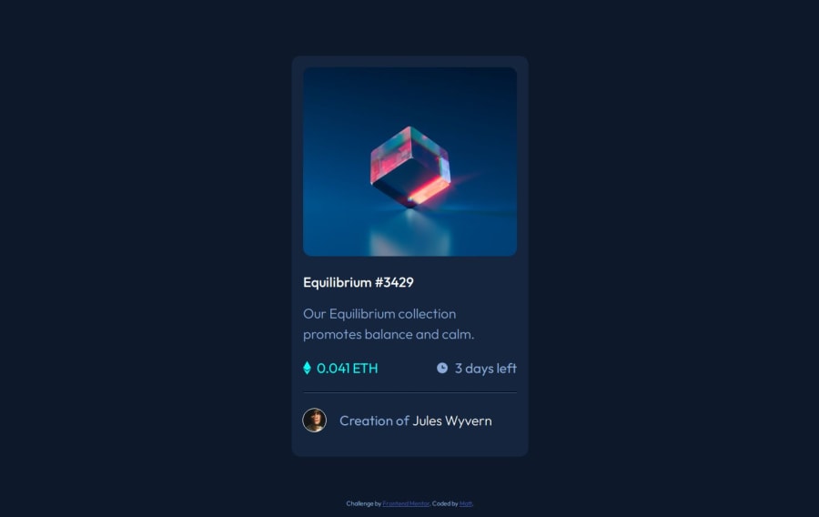
Design comparison
Solution retrospective
For a simple project the only thing slightly proud of is that did the switching of the transparent overlay on or off with just CSS instead of needing to use JS to provide the interactivity.
Done via use of the hover swapping the z-index of the two so the absolute overlay stays higher only as long as it is being hovered.
What specific areas of your project would you like help with?Only thing that gave me issue is proportions trying to make it match the image, while every other part seems about quite close it seems like the card itself just ends up to small to match the image like the content is not enough to fill it if I expand it to match with the other elements properly sized.
Although I suspect that may be an issue of perspective in that I try to have it fill same space as in the image and if the image is zoomed or cropped that would be pointless and inaccurate but it only thing I got to work off of.
Community feedback
- @AdamCyganPosted 2 months ago
In such naming like: creatorcontainer, avatarimage, etc. I would keep the dash (-) as it now causes readibility issues. Also I would stick to the BEM to keep the css class names precise and concise.
The visual is ok.
0
Please log in to post a comment
Log in with GitHubJoin our Discord community
Join thousands of Frontend Mentor community members taking the challenges, sharing resources, helping each other, and chatting about all things front-end!
Join our Discord
